We can often simplify or compress our data if we recognize the existence of clusters.
Further, we can often interpret clusters by assigning them labels.
However, note that these categories or “labels” are assigned after the fact.
And, we may not be able to interpret clusters or assign them labels in some cases.
That is, clustering represents the first example we will see of unsupervised learning.
Supervised vs Unsupervised
Supervised methods: Data items have labels, and we want to learn a function that correctly assigns labels to new data items.
Unsupervised methods: Data items do not have labels, and we want to learn a function that extracts important patterns from the data.
Applications of Clustering
Image Processing
Cluster images based on their visual content.
Compress images based on color clusters.
Web Mining
Cluster groups of users based on webpage access patterns.
Cluster web pages based on their content.
Bioinformatics
Cluster similar proteins together (by structure or function).
Cluster cell types (by gene activity).
And many more …
The Clustering Problem
When we apply clustering, what problem are we trying to solve?
We will answer this question informally at first, then apply formal criteria.
Informally, a clustering is:
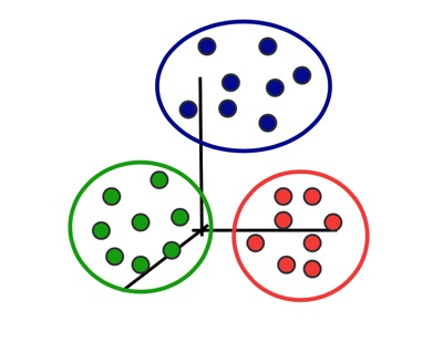
a grouping of data objects, such that the objects within a group are similar (or near) to one another and dissimilar (or far) from the objects in other groups.
(keep in mind that if we use a distance function as a dissimilarity measure, then “far” implies “different”)
So we want our clustering algorithm to:
minimize intra-cluster distances.
maximize inter-cluster distances.
The Clustering Problem, continued
Here are the basic questions we need to ask about clustering:
What is the right kind of “similarity” to use?
What is a good partition of objects?
i.e., how is the quality of a solution measured?
How to find a good partition?
Are there efficient algorithms?
Are there algorithms that are guaranteed to find good clusters?
Now note that even with our more-formal discussion, the criteria for deciding on a “best” clustering can still be ambiguous.
Later, we will discuss hierarchical clustering which let’s us consider clustering at multiple scales.
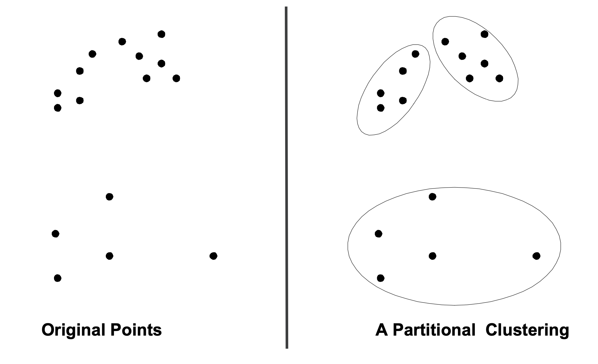
Partitional Clustering
For now, we’ll focus on partitional clustering.
Points are divided into a set of non-overlapping groups:
Each object belongs to one, and only one, cluster. (mutually exclusive)
The set of clusters covers all the objects. (exhaustive)
We are going to assume for now that the number of clusters, \(k\), is given in advance.
The \(k\)-means Algorithm
Assumptions
Now, we are ready to state our first formalization of the clustering problem.
We will assume that
data items are represented by points in \(d\)-dimensional space, \(\mathbb{R}^d\), i.e., has \(d\) features,
the number of points, \(N\), is given, and
the number of clusters \(K\) is given.
Minimizing a Cost Function
Find \(K\) disjoint clusters \(C_k\), each described by points \(c_1, \dots, c_K\) (called centers, centroids, or means) that minimizes
These can be randomly chosen data points, or by some other method such as \(k\)-means++
For each \(j\), define the cluster \(C_j\) as the set of points in \(X\) that are closest to center \(c_j\).
Nearer to \(c_j\) than to any other center.
For each \(j\), update \(c_j\) to be the center of mass of cluster \(C_j\).
In other words, \(c_j\) is the mean of the vectors in \(C_j\).
Repeat (i.e., go to Step 2) until convergence.
Either the cluster centers change below a threshold, or inertia changes below a threshold or a maximum number of iterations is reached.
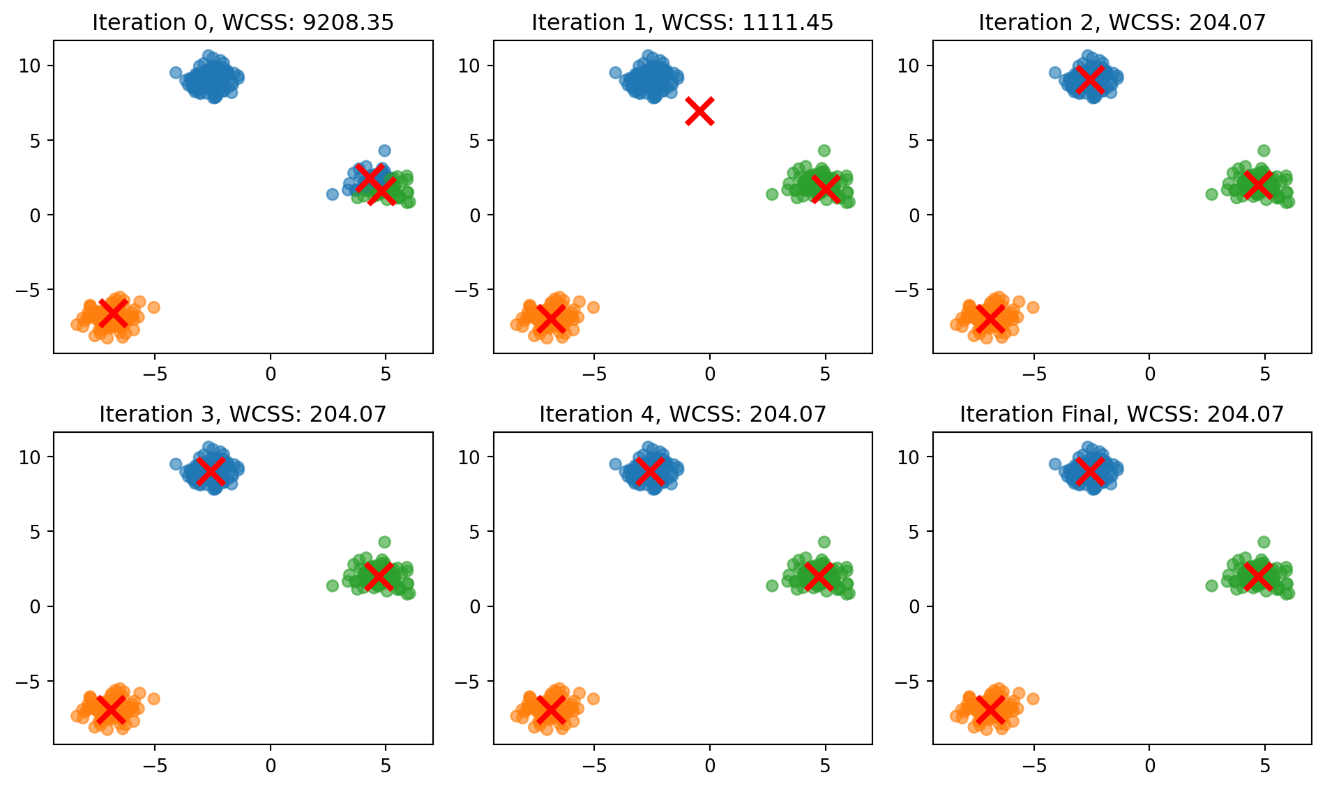
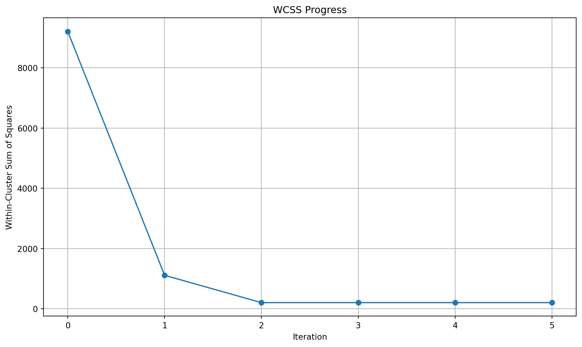
Let’s see this in practice with well separated clusters and also look at the Within-Cluster Sum of Square (WCSS).
Code
import numpy as npimport matplotlib.pyplot as pltfrom sklearn.datasets import make_blobs# Set random seed for reproducibilitynp.random.seed(42)# Generate sample datan_samples =300X, _ = make_blobs(n_samples=n_samples, centers=3, cluster_std=0.60, random_state=42)# Initialize centroids randomlyk =3centroids = X[np.random.choice(n_samples, k, replace=False)]# Function to assign points to clustersdef assign_clusters(X, centroids): distances = np.sqrt(((X - centroids[:, np.newaxis])**2).sum(axis=2))return np.argmin(distances, axis=0)# Function to update centroidsdef update_centroids(X, labels, k):return np.array([X[labels == i].mean(axis=0) for i inrange(k)])# Function to calculate within-cluster sum of squaresdef calculate_wcss(X, labels, centroids):returnsum(np.sum((X[labels == i] - centroids[i])**2) for i inrange(k))# Set up the clustering progress plotfig1, axs = plt.subplots(2, 3, figsize=(10, 6))axs = axs.ravel()# Colors for each clustercolors = ['#1f77b4', '#ff7f0e', '#2ca02c']# List to store WCSS valueswcss_values = []# Run k-means iterations and plotfor i inrange(6):# Assign clusters labels = assign_clusters(X, centroids)# Calculate WCSS wcss = calculate_wcss(X, labels, centroids) wcss_values.append(wcss)# Plot the current clustering state axs[i].scatter(X[:, 0], X[:, 1], c=[colors[l] for l in labels], alpha=0.6) axs[i].scatter(centroids[:, 0], centroids[:, 1], c='red', marker='x', s=200, linewidths=3) axs[i].set_title(f'Iteration {i if i <5else"Final"}, WCSS: {wcss:.2f}') axs[i].set_xlim(X[:, 0].min() -1, X[:, 0].max() +1) axs[i].set_ylim(X[:, 1].min() -1, X[:, 1].max() +1)# Update centroids (except for the last iteration)if i <5: centroids = update_centroids(X, labels, k)plt.tight_layout()# Create a separate plot for WCSS progressfig2, ax = plt.subplots(figsize=(10, 6))ax.plot(range(6), wcss_values, marker='o')ax.set_title('WCSS Progress')ax.set_xlabel('Iteration')ax.set_ylabel('Within-Cluster Sum of Squares')ax.grid(True)plt.tight_layout()plt.show()
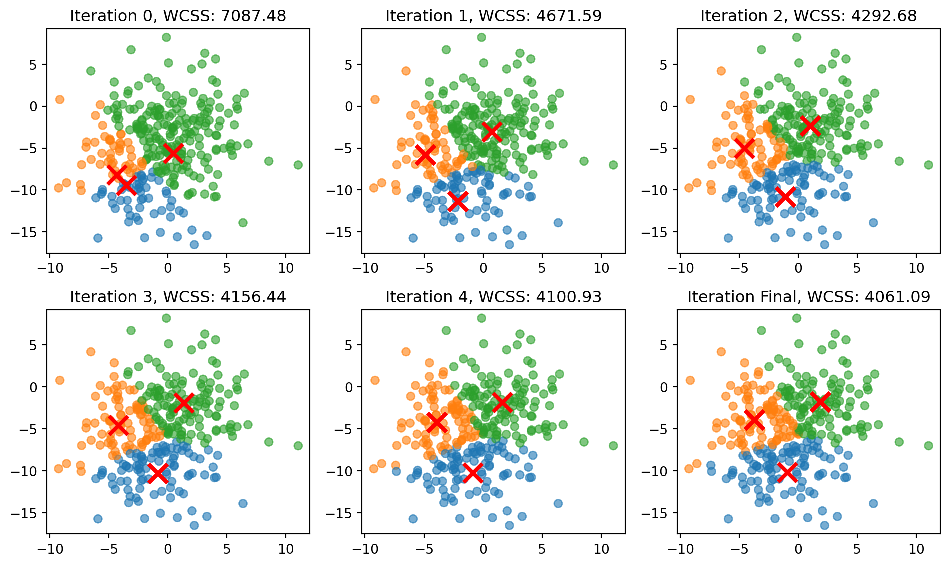
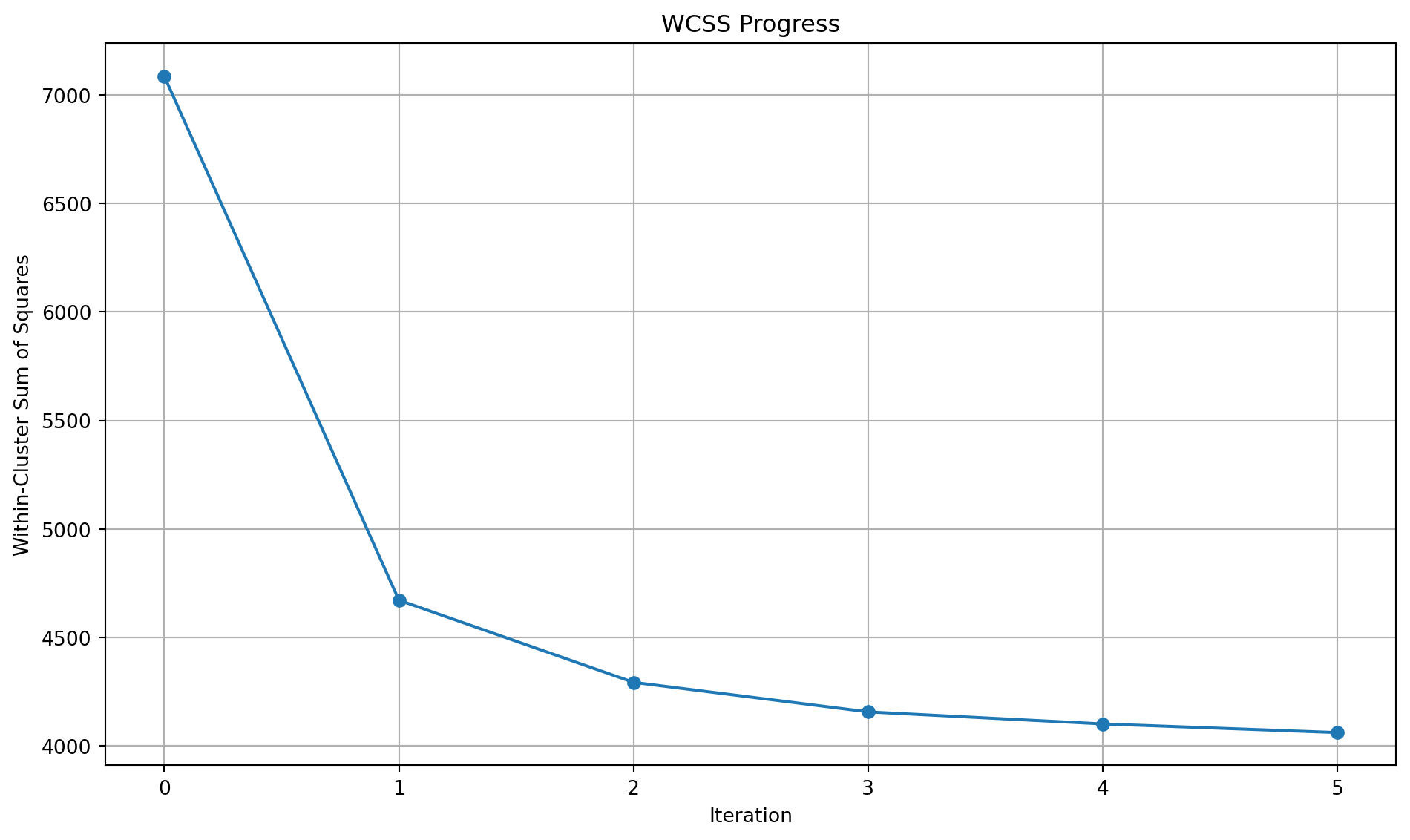
Let’s see this in practice with overlapping clusters and also look at the WCSS.
Code
import numpy as npimport matplotlib.pyplot as pltfrom sklearn.datasets import make_blobs# Set random seed for reproducibilitynp.random.seed(42)# Generate sample datan_samples =300X, _ = make_blobs(n_samples=n_samples, centers=3, cluster_std=3.00, random_state=2)# Initialize centroids randomlyk =3centroids = X[np.random.choice(n_samples, k, replace=False)]# Function to assign points to clustersdef assign_clusters(X, centroids): distances = np.sqrt(((X - centroids[:, np.newaxis])**2).sum(axis=2))return np.argmin(distances, axis=0)# Function to update centroidsdef update_centroids(X, labels, k):return np.array([X[labels == i].mean(axis=0) for i inrange(k)])# Function to calculate within-cluster sum of squaresdef calculate_wcss(X, labels, centroids):returnsum(np.sum((X[labels == i] - centroids[i])**2) for i inrange(k))# Set up the clustering progress plotfig1, axs = plt.subplots(2, 3, figsize=(10, 6))axs = axs.ravel()# Colors for each clustercolors = ['#1f77b4', '#ff7f0e', '#2ca02c']# List to store WCSS valueswcss_values = []# Run k-means iterations and plotfor i inrange(6):# Assign clusters labels = assign_clusters(X, centroids)# Calculate WCSS wcss = calculate_wcss(X, labels, centroids) wcss_values.append(wcss)# Plot the current clustering state axs[i].scatter(X[:, 0], X[:, 1], c=[colors[l] for l in labels], alpha=0.6) axs[i].scatter(centroids[:, 0], centroids[:, 1], c='red', marker='x', s=200, linewidths=3) axs[i].set_title(f'Iteration {i if i <5else"Final"}, WCSS: {wcss:.2f}') axs[i].set_xlim(X[:, 0].min() -1, X[:, 0].max() +1) axs[i].set_ylim(X[:, 1].min() -1, X[:, 1].max() +1)# Update centroids (except for the last iteration)if i <5: centroids = update_centroids(X, labels, k)plt.tight_layout()# Create a separate plot for WCSS progressfig2, ax = plt.subplots(figsize=(10, 6))ax.plot(range(6), wcss_values, marker='o')ax.set_title('WCSS Progress')ax.set_xlabel('Iteration')ax.set_ylabel('Within-Cluster Sum of Squares')ax.grid(True)plt.tight_layout()plt.show()
Limitations of \(k\)-means
As you can see, \(k\)-means can work very well.
However, we don’t have any guarantees on the performance of \(k\)-means.
In particular, there are various settings in which \(k\)-means can fail to do a good job.
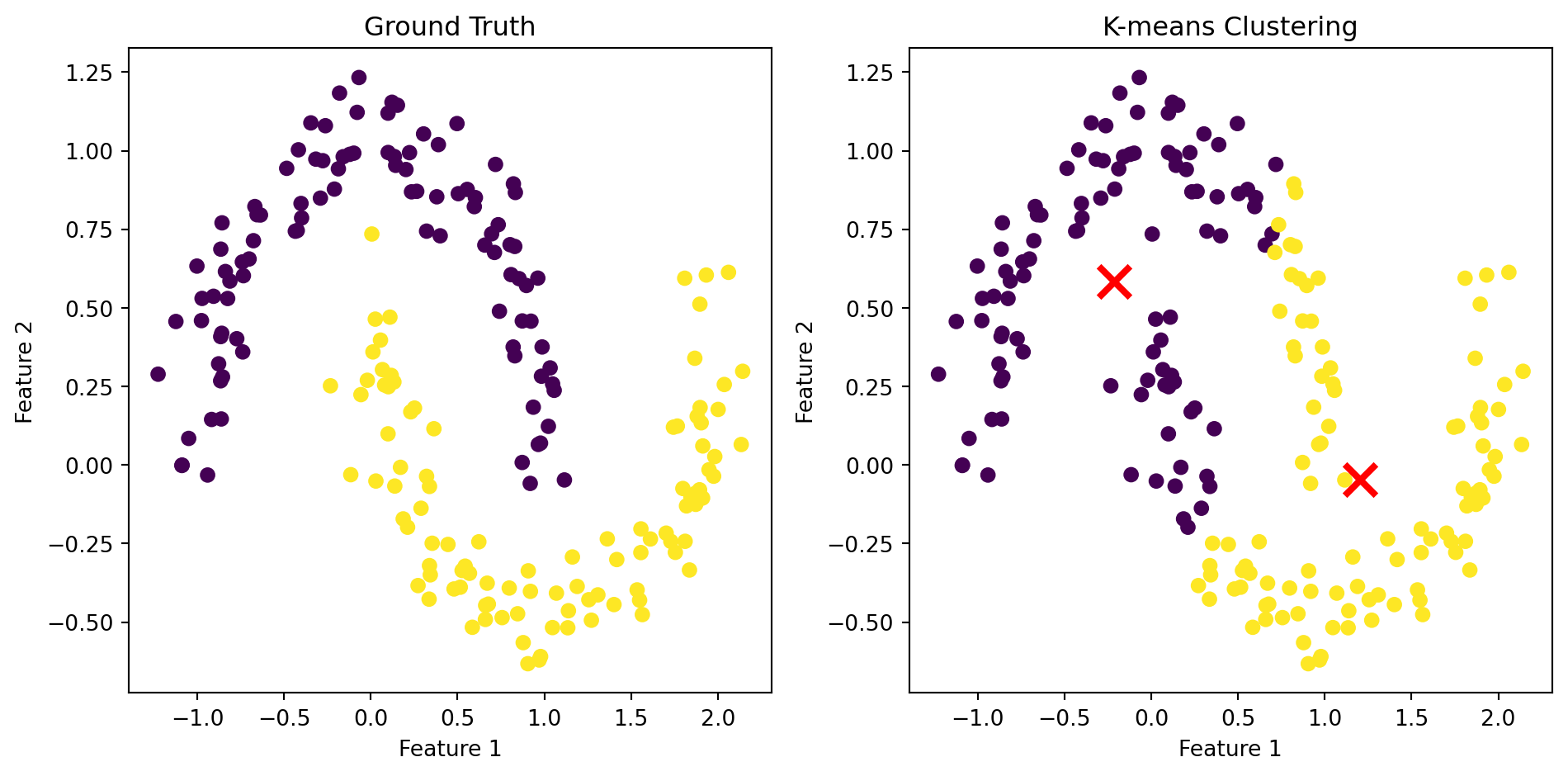
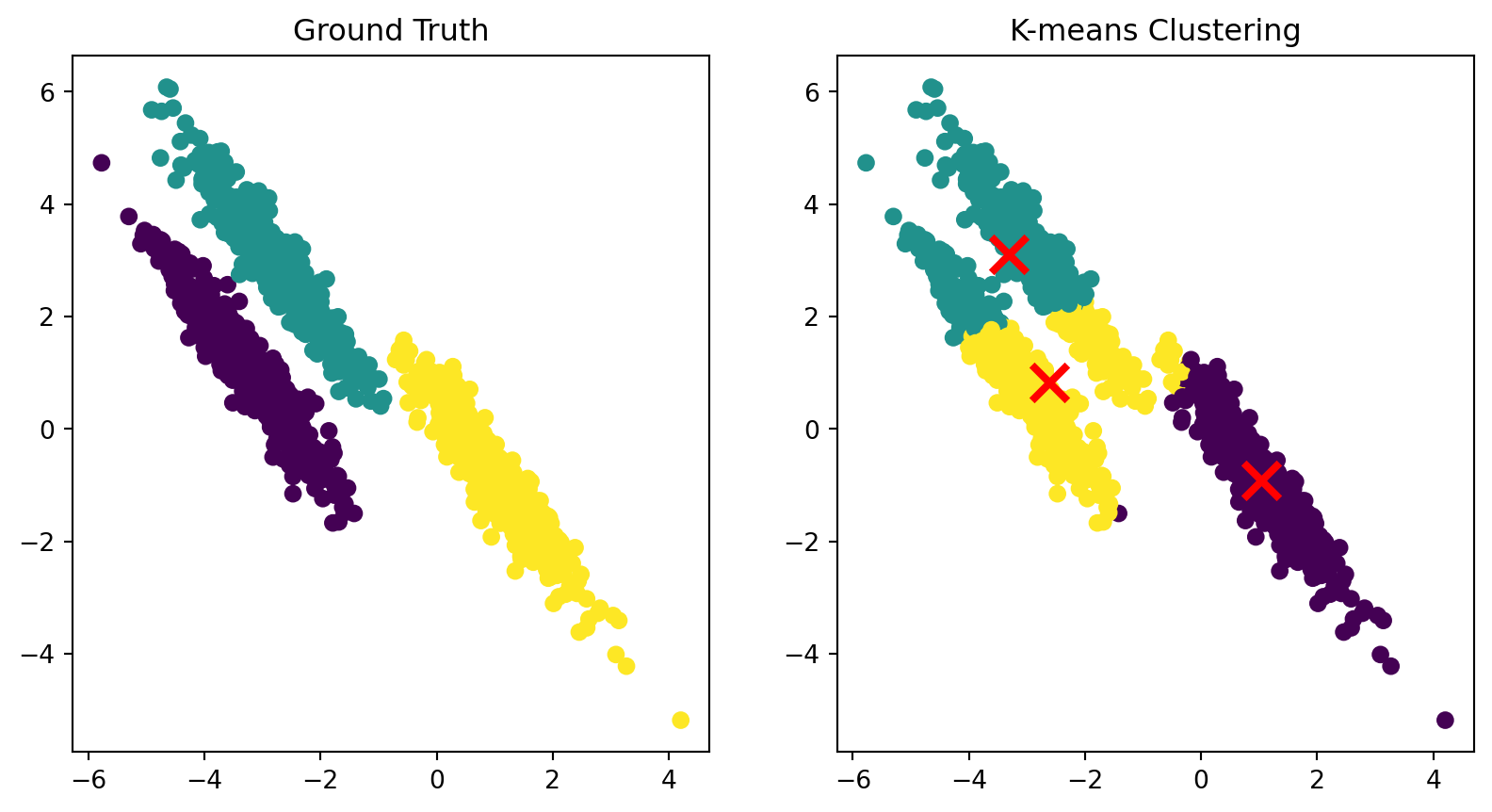
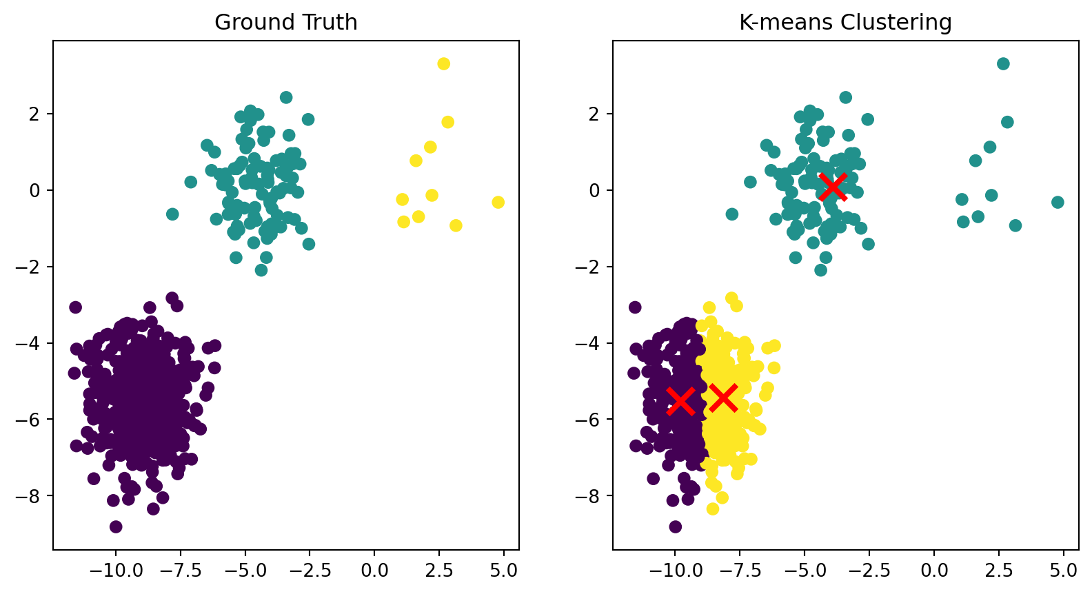
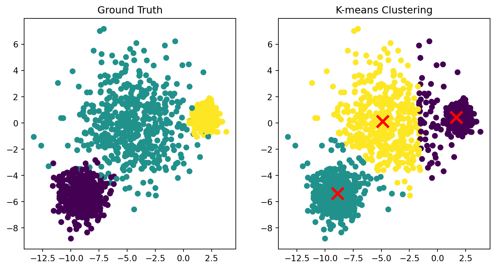
Limitation: non-spherical clusters
Because each point is assigned to its closest center, the points in a cluster are implicitly assumed to be arranged in a sphere around the center.
Code
# Author: Phil Roth <mr.phil.roth@gmail.com># Arturo Amor <david-arturo.amor-quiroz@inria.fr># License: BSD 3 clause## From https://scikit-learn.org/stable/auto_examples/cluster/plot_kmeans_assumptions.htmlimport numpy as npfrom sklearn.datasets import make_moonsimport matplotlib.pyplot as pltfrom sklearn.cluster import KMeans# Generate two half-moon clustersX_moons, y_moons_true = make_moons(n_samples=200, noise=0.1, random_state=42)# Perform k-means clusteringkmeans = KMeans(n_clusters=2, random_state=42)y_moons_pred = kmeans.fit_predict(X_moons)# Create a figure with two subplots side by sidefig, (ax1, ax2) = plt.subplots(1, 2, figsize=(10, 5))# Plot ground truthax1.scatter(X_moons[:, 0], X_moons[:, 1], c=y_moons_true, cmap='viridis')ax1.set_title('Ground Truth')ax1.set_xlabel('Feature 1')ax1.set_ylabel('Feature 2')# Plot k-means clustering resultax2.scatter(X_moons[:, 0], X_moons[:, 1], c=y_moons_pred, cmap='viridis')ax2.set_title('K-means Clustering')ax2.set_xlabel('Feature 1')ax2.set_ylabel('Feature 2')# Add cluster centers to the k-means plotax2.scatter(kmeans.cluster_centers_[:, 0], kmeans.cluster_centers_[:, 1], marker='x', s=200, linewidths=3, color='r', zorder=10)plt.tight_layout()plt.show()
K-means clustering on a dataset with anisotropic clusters.
What would happen if we used Euclidean distance as our dissimilarity metric in this feature space?
(This is what \(k\)-means uses.)
Clearly, the influence of income would dominate the other two features. For example, a difference of gender is about as significant as a difference of one dollar of yearly income.
We are unlikely to expose gender-based differences if we cluster using this representation.
The most common way to handle this is feature scaling.
Feature Scaling
The basic idea is to rescale each feature separately, so that its range of values is about the same as all other features.
For example, one may choose to:
shift each feature independently by subtracting the mean over all observed values.
This means that each feature is now centered on zero.
Then rescale each feature so that the standard deviation overall observed values is 1.
This means that the feature will have about the same range of values as all the others.
\(k\)-means Clustering Examples
Example 1: Customer Segmentation
Customer Segmentation
Another powerful application of \(k\)-means clustering is customer segmentation in e-commerce.
Businesses want to understand their customers to provide better service and targeted marketing
Group customers with similar behaviors and characteristics \(\rightarrow\)personas
This enables personalized marketing campaigns, product recommendations, and customer service strategies
E-commerce Customer Data
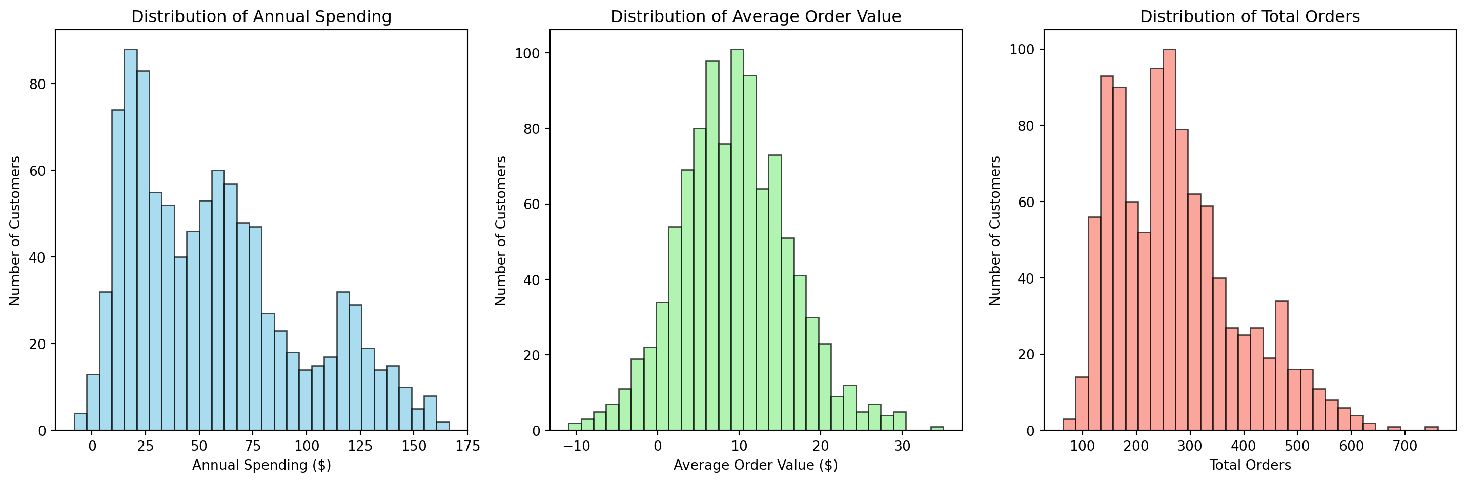
Let’s synthesize e-commerce data to segment customers based on their purchasing behavior.
fig, axes = plt.subplots(1, 3, figsize=(15, 5))# Annual Spendingaxes[0].hist(df['Annual_Spending'], bins=30, alpha=0.7, color='skyblue', edgecolor='black')axes[0].set_title('Distribution of Annual Spending')axes[0].set_xlabel('Annual Spending ($)')axes[0].set_ylabel('Number of Customers')# Average Order Valueaxes[1].hist(df['Avg_Order_Value'], bins=30, alpha=0.7, color='lightgreen', edgecolor='black')axes[1].set_title('Distribution of Average Order Value')axes[1].set_xlabel('Average Order Value ($)')axes[1].set_ylabel('Number of Customers')# Total Ordersaxes[2].hist(df['Total_Orders'], bins=30, alpha=0.7, color='salmon', edgecolor='black')axes[2].set_title('Distribution of Total Orders')axes[2].set_xlabel('Total Orders')axes[2].set_ylabel('Number of Customers')plt.tight_layout()plt.show()
Distribution of customer features
Can you see clusters?
Feature Scaling is Critical
Before clustering, we need to scale our features since they have very different ranges:
Original feature ranges:
Annual Spending: $-8 - $166
Avg Order Value: $-11 - $35
Total Orders: 64 - 760

Scaled feature ranges:
Annual Spending: -1.66 - 2.78
Avg Order Value: -2.99 - 3.77
Total Orders: -1.81 - 4.16
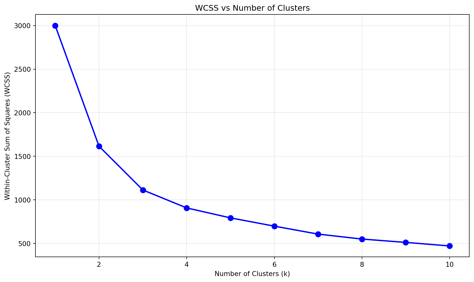
Searching Cluster Numbers
What cluster number should we pick?
Code
# Calculate WCSS for different numbers of clusterswcss = []K_range =range(1, 11)for k in K_range: kmeans = KMeans(n_clusters=k, random_state=42, n_init=10) kmeans.fit(X_scaled) wcss.append(kmeans.inertia_)# Plot the elbow curveplt.figure(figsize=(10, 6))plt.plot(K_range, wcss, 'bo-', linewidth=2, markersize=8)plt.title('WCSS vs Number of Clusters')plt.xlabel('Number of Clusters (k)')plt.ylabel('Within-Cluster Sum of Squares (WCSS)')plt.grid(True, alpha=0.3)plt.tight_layout()plt.show()
Elbow method for determining optimal number of clusters
Customer Segmentation Results
Visualize in 2D using PCA which we’ll cover later.
Code
# Perform k-means clustering with k=4kmeans = KMeans(n_clusters=4, random_state=42, n_init=10)cluster_labels = kmeans.fit_predict(X_scaled)# Add cluster labels to the dataframedf['Cluster'] = cluster_labels# Visualize clusters in 2D using PCApca = PCA(n_components=2)X_pca = pca.fit_transform(X_scaled)plt.figure(figsize=(12, 5))# Plot 1: PCA visualizationplt.subplot(1, 2, 1)scatter = plt.scatter(X_pca[:, 0], X_pca[:, 1], c=cluster_labels, cmap='viridis', alpha=0.6)plt.scatter(kmeans.cluster_centers_[:, 0], kmeans.cluster_centers_[:, 1], c='red', marker='x', s=200, linewidths=3, label='Centroids')plt.title('Customer Segments (PCA View)')plt.xlabel(f'PC1 ({pca.explained_variance_ratio_[0]:.1%} variance)')plt.ylabel(f'PC2 ({pca.explained_variance_ratio_[1]:.1%} variance)')plt.legend()# Plot 2: Feature space visualizationplt.subplot(1, 2, 2)plt.scatter(df['Annual_Spending'], df['Avg_Order_Value'], c=cluster_labels, cmap='viridis', alpha=0.6)plt.title('Customer Segments (Annual Spending vs Avg Order Value)')plt.xlabel('Annual Spending ($)')plt.ylabel('Average Order Value ($)')plt.tight_layout()plt.show()
K-means customer segmentation results
Customer Segment Profiles
Code
# Analyze each clustercluster_summary = df.groupby('Cluster').agg({'Annual_Spending': ['mean', 'std'],'Avg_Order_Value': ['mean', 'std'],'Total_Orders': ['mean', 'std'],'Customer_ID': 'count'}).round(2)cluster_summary.columns = ['Avg_Annual_Spending', 'Std_Annual_Spending', 'Avg_Order_Value', 'Std_Order_Value','Avg_Total_Orders', 'Std_Total_Orders', 'Count']print("Customer Segment Profiles:")print("="*60)for cluster insorted(df['Cluster'].unique()): cluster_data = df[df['Cluster'] == cluster]print(f"\nSegment {cluster} ({len(cluster_data)} customers):")print(f" • Average Annual Spending: ${cluster_data['Annual_Spending'].mean():.0f}")print(f" • Average Order Value: ${cluster_data['Avg_Order_Value'].mean():.0f}")print(f" • Average Total Orders: {cluster_data['Total_Orders'].mean():.1f}")
Customer Segment Profiles:
============================================================

Segment 0 (193 customers):
  • Average Annual Spending: $121
  • Average Order Value: $15
  • Average Total Orders: 458.9

Segment 1 (251 customers):
  • Average Annual Spending: $28
  • Average Order Value: $14
  • Average Total Orders: 161.1

Segment 2 (255 customers):
  • Average Annual Spending: $26
  • Average Order Value: $2
  • Average Total Orders: 268.5

Segment 3 (301 customers):
  • Average Annual Spending: $67
  • Average Order Value: $8
  • Average Total Orders: 258.3
Segment
Percentage
Annual Spending
Average Order Value
Total Orders
High-value
20%
\(120 \pm 20\)
\(15 \pm 3\)
\(450 \pm 80\)
Moderate
40%
\(60 \pm 15\)
\(8 \pm 2\)
\(250 \pm 50\)
Bargain
25%
\(25 \pm 8\)
\(12 \pm 4\)
\(150 \pm 30\)
Occasional
15%
\(15 \pm 5\)
\(3 \pm 1\)
\(300 \pm 60\)
Example 2: Plant Classification Based on Morphology
Plant Species Classification with Iris Data
Let’s explore another real-world application using the famous Iris dataset from scikit-learn.
The Iris dataset contains measurements of 150 iris flowers from 3 species
Each flower has 4 features: sepal length, sepal width, petal length, and petal width
This is a classic example where we know the true species but want to see if k-means can discover these natural groupings
Loading and Exploring the Iris Dataset
Code
from sklearn.datasets import load_irisimport matplotlib.pyplot as pltimport numpy as npfrom mpl_toolkits.mplot3d import Axes3D# Load the Iris datasetiris = load_iris()X = iris.datay = iris.targetfeature_names = iris.feature_namestarget_names = iris.target_namesprint("Iris Dataset Information:")print("="*40)print(f"Number of samples: {X.shape[0]}")print(f"Number of features: {X.shape[1]}")print(f"Feature names: {feature_names}")print(f"Target names: {target_names}")print(f"Number of species: {len(target_names)}")# Display first few samplesprint(f"\nFirst 5 samples:")print(f"{'Sepal Length':<12}{'Sepal Width':<11}{'Petal Length':<12}{'Petal Width':<11}{'Species':<8}")print("-"*60)for i inrange(5):print(f"{X[i, 0]:<12.1f}{X[i, 1]:<11.1f}{X[i, 2]:<12.1f}{X[i, 3]:<11.1f}{target_names[y[i]]:<8}")
Iris Dataset Information:
========================================
Number of samples: 150
Number of features: 4
Feature names: ['sepal length (cm)', 'sepal width (cm)', 'petal length (cm)', 'petal width (cm)']
Target names: ['setosa' 'versicolor' 'virginica']
Number of species: 3

First 5 samples:
Sepal Length Sepal Width Petal Length Petal Width Species
------------------------------------------------------------
5.1          3.5         1.4          0.2         setosa
4.9          3.0         1.4          0.2         setosa
4.7          3.2         1.3          0.2         setosa
4.6          3.1         1.5          0.2         setosa
5.0          3.6         1.4          0.2         setosa
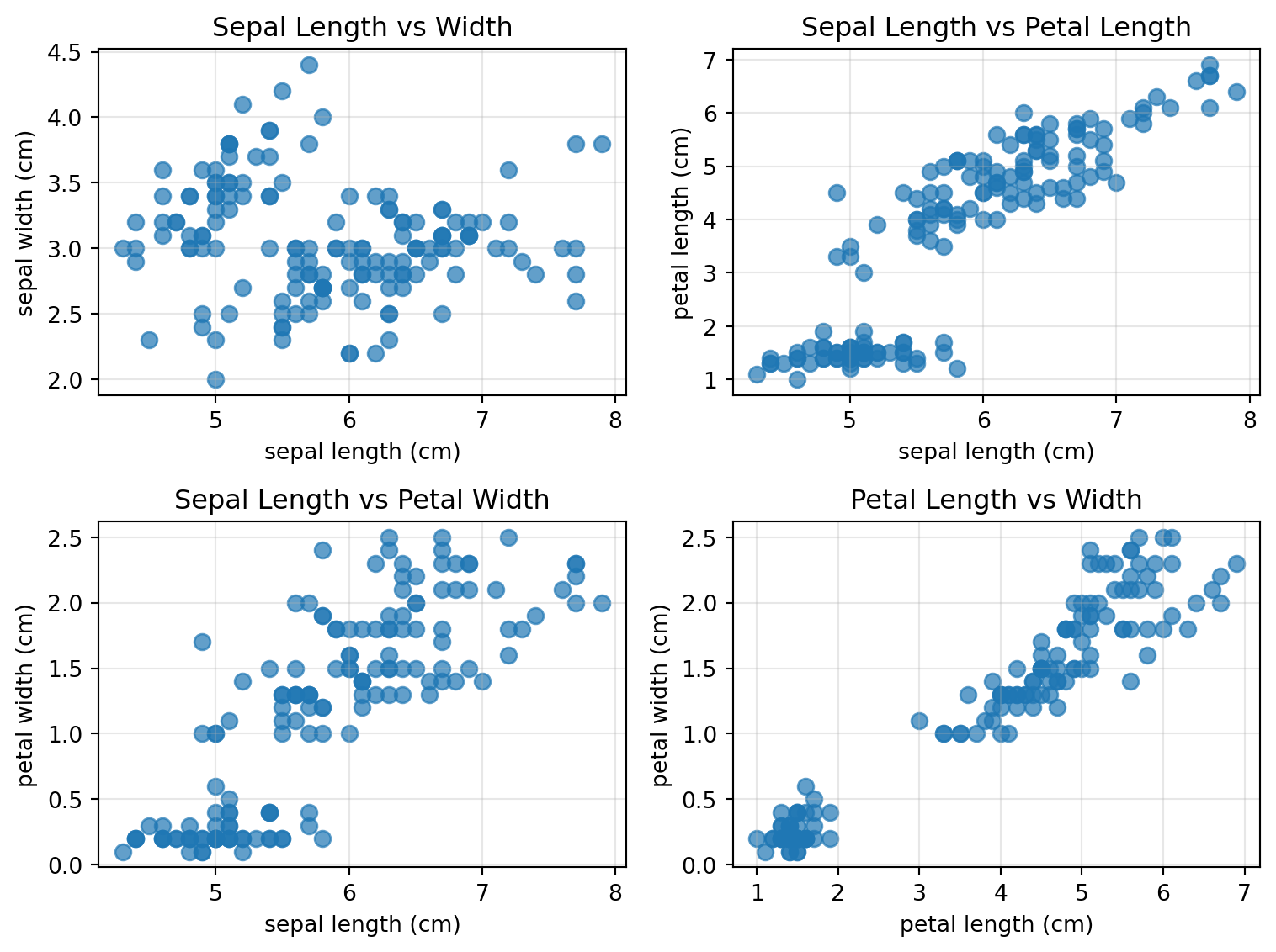
Visualizing Iris Data in 2D
Let’s compare features in pairs. Do you see clusters?
Code
fig, axes = plt.subplots(2, 2, figsize=(8, 6))axes = axes.ravel()# Plot all pairwise combinations of featuresfeature_pairs = [(0, 1), (0, 2), (0, 3), (2, 3)]titles = ['Sepal Length vs Width', 'Sepal Length vs Petal Length', 'Sepal Length vs Petal Width', 'Petal Length vs Width']for i, (feat1, feat2) inenumerate(feature_pairs): axes[i].scatter(X[:, feat1], X[:, feat2], alpha=0.7, s=50) axes[i].set_xlabel(feature_names[feat1]) axes[i].set_ylabel(feature_names[feat2]) axes[i].set_title(titles[i]) axes[i].grid(True, alpha=0.3)plt.tight_layout()plt.show()
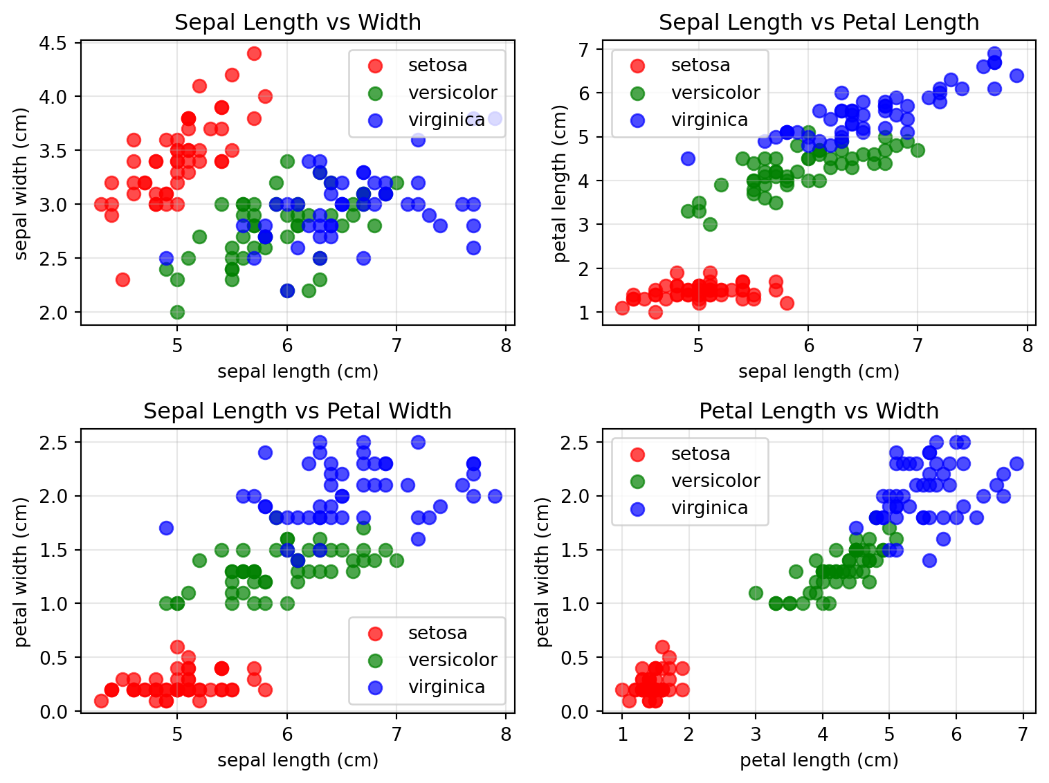
Visualizing Iris Data in 2D
Feature pairs with ground truth labels.
Code
fig, axes = plt.subplots(2, 2, figsize=(8, 6))axes = axes.ravel()# Color mapping for speciescolors = ['red', 'green', 'blue']# Plot all pairwise combinations of featuresfeature_pairs = [(0, 1), (0, 2), (0, 3), (2, 3)]titles = ['Sepal Length vs Width', 'Sepal Length vs Petal Length', 'Sepal Length vs Petal Width', 'Petal Length vs Width']for i, (feat1, feat2) inenumerate(feature_pairs):for species inrange(3): mask = y == species axes[i].scatter(X[mask, feat1], X[mask, feat2], c=colors[species], label=target_names[species], alpha=0.7, s=50) axes[i].set_xlabel(feature_names[feat1]) axes[i].set_ylabel(feature_names[feat2]) axes[i].set_title(titles[i]) axes[i].legend() axes[i].grid(True, alpha=0.3)plt.tight_layout()plt.show()
Question: What observations can you make?
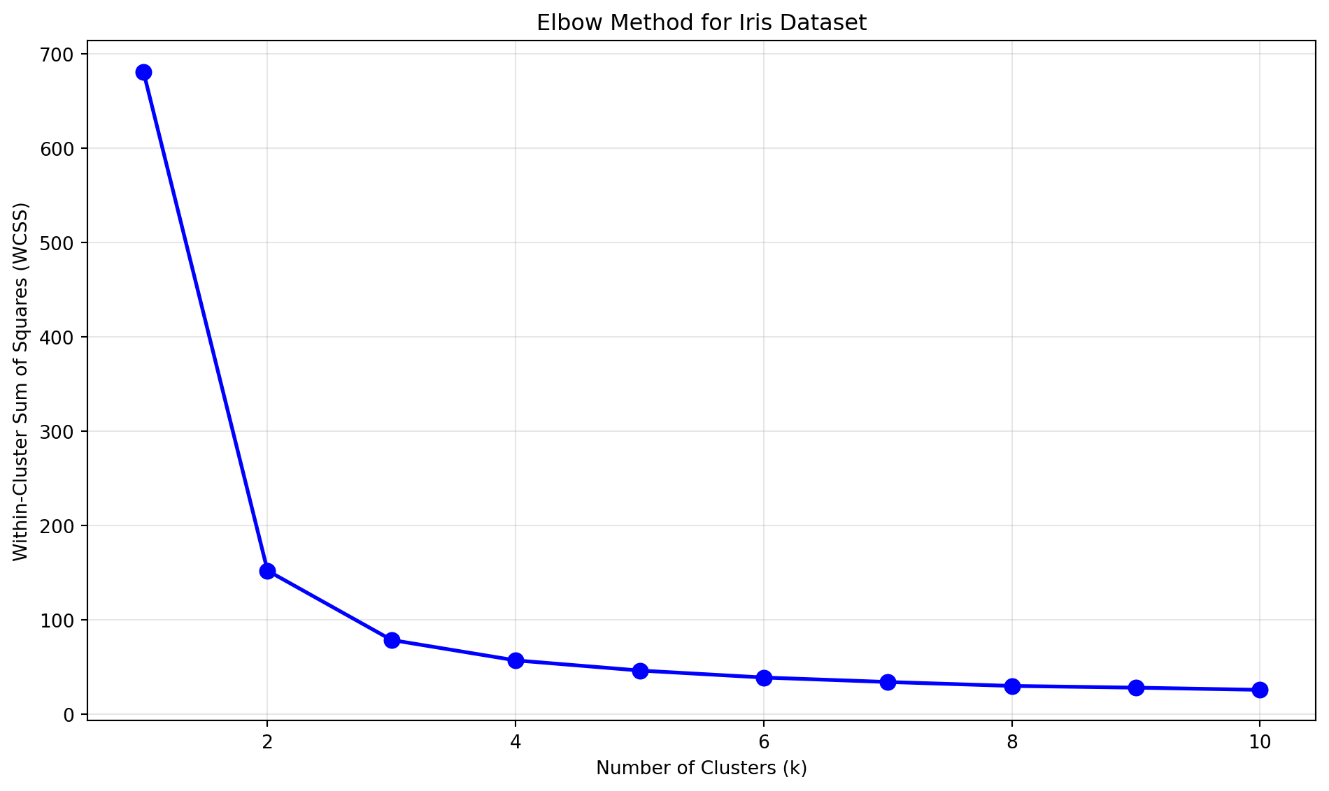
Try different cluster numbers
Code
from sklearn.cluster import KMeansimport matplotlib.pyplot as pltimport numpy as np# Calculate WCSS for different numbers of clusterswcss = []K_range =range(1, 11)for k in K_range: kmeans = KMeans(n_clusters=k, random_state=42, n_init=10) kmeans.fit(X) wcss.append(kmeans.inertia_)# Plot the elbow curveplt.figure(figsize=(10, 6))plt.plot(K_range, wcss, 'bo-', linewidth=2, markersize=8)plt.title('Elbow Method for Iris Dataset')plt.xlabel('Number of Clusters (k)')plt.ylabel('Within-Cluster Sum of Squares (WCSS)')plt.grid(True, alpha=0.3)plt.tight_layout()plt.show()
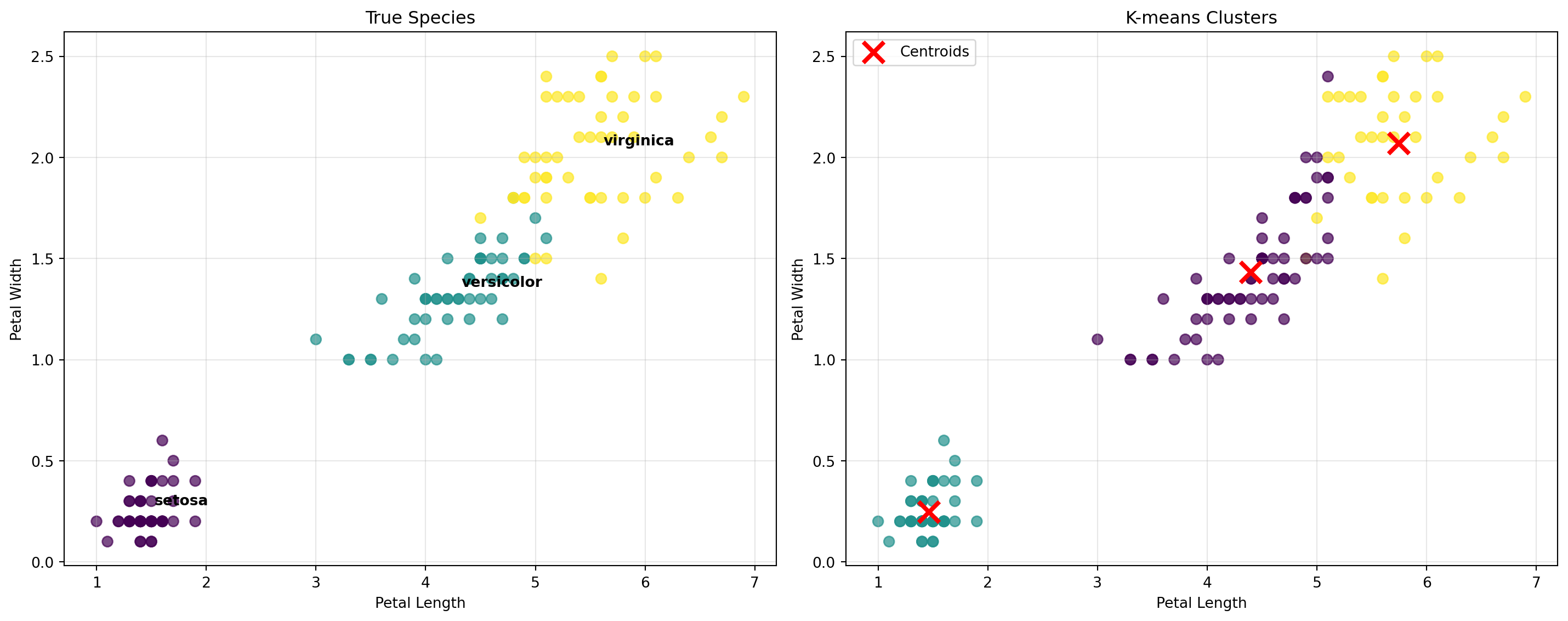
K-means Clustering on Iris Data
Results for \(k=3\) clusters.
Code
from sklearn.cluster import KMeansfrom sklearn.metrics import adjusted_rand_score, confusion_matriximport seaborn as sns# Perform k-means clustering with k=3 (we know there are 3 species)kmeans = KMeans(n_clusters=3, random_state=42, n_init=10)cluster_labels = kmeans.fit_predict(X)# Create confusion matrixcm = confusion_matrix(y, cluster_labels)# Convert to DataFrame for better visualizationcm_df = pd.DataFrame(cm, index=target_names, columns=[f'Cluster {i}'for i inrange(3)])print(f"\nConfusion Matrix:")print("Rows: True species, Columns: Predicted clusters")print(cm_df)# Visualize clustering results in 2Dfig, axes = plt.subplots(1, 2, figsize=(15, 6))# Plot 1: True speciesscatter1 = axes[0].scatter(X[:, 2], X[:, 3], c=y, cmap='viridis', alpha=0.7, s=50)axes[0].set_xlabel('Petal Length')axes[0].set_ylabel('Petal Width')axes[0].set_title('True Species')axes[0].grid(True, alpha=0.3)# Add species labelsfor i, species inenumerate(target_names): mask = y == i centroid_x = X[mask, 2].mean() centroid_y = X[mask, 3].mean() axes[0].annotate(species, (centroid_x, centroid_y), xytext=(5, 5), textcoords='offset points', fontsize=10, fontweight='bold')# Plot 2: K-means clustersscatter2 = axes[1].scatter(X[:, 2], X[:, 3], c=cluster_labels, cmap='viridis', alpha=0.7, s=50)axes[1].scatter(kmeans.cluster_centers_[:, 2], kmeans.cluster_centers_[:, 3], c='red', marker='x', s=200, linewidths=3, label='Centroids')axes[1].set_xlabel('Petal Length')axes[1].set_ylabel('Petal Width')axes[1].set_title(f'K-means Clusters')axes[1].legend()axes[1].grid(True, alpha=0.3)plt.tight_layout()plt.show()
# Analyze cluster assignmentsprint("Cluster Analysis:")print("="*50)for cluster inrange(3): mask = cluster_labels == cluster cluster_data = X[mask] true_species = y[mask]# Find the most common species in this cluster species_counts = np.bincount(true_species) dominant_species = np.argmax(species_counts) purity = species_counts[dominant_species] /len(true_species)print(f"\nCluster {cluster}:")print(f" • Size: {len(cluster_data)} samples")print(f" • Dominant species: {target_names[dominant_species]} ({purity:.1%})")print(f" • Average petal length: {cluster_data[:, 2].mean():.1f} cm")print(f" • Average petal width: {cluster_data[:, 3].mean():.1f} cm")print(f" • Average sepal length: {cluster_data[:, 0].mean():.1f} cm")print(f" • Average sepal width: {cluster_data[:, 1].mean():.1f} cm")
Cluster Analysis:
==================================================

Cluster 0:
  • Size: 62 samples
  • Dominant species: versicolor (77.4%)
  • Average petal length: 4.4 cm
  • Average petal width: 1.4 cm
  • Average sepal length: 5.9 cm
  • Average sepal width: 2.7 cm

Cluster 1:
  • Size: 50 samples
  • Dominant species: setosa (100.0%)
  • Average petal length: 1.5 cm
  • Average petal width: 0.2 cm
  • Average sepal length: 5.0 cm
  • Average sepal width: 3.4 cm

Cluster 2:
  • Size: 38 samples
  • Dominant species: virginica (94.7%)
  • Average petal length: 5.7 cm
  • Average petal width: 2.1 cm
  • Average sepal length: 6.9 cm
  • Average sepal width: 3.1 cm
Key Insights:
K-means successfully identified the three iris species
Setosa is perfectly separated from the other species
Versicolor and Virginica show some overlap, which is realistic
Petal measurements are more discriminative than sepal measurements
Overall clustering quality pretty good!
Why K-means Works Well on Iris Data
Well-separated clusters: The three iris species have distinct characteristics
Spherical cluster shapes: Each species forms roughly spherical groups in feature space
Appropriate feature scaling: All measurements are in the same units (centimeters)
A Priori knowledge: We know the true number of species (cluster number)
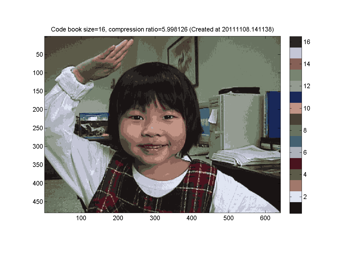
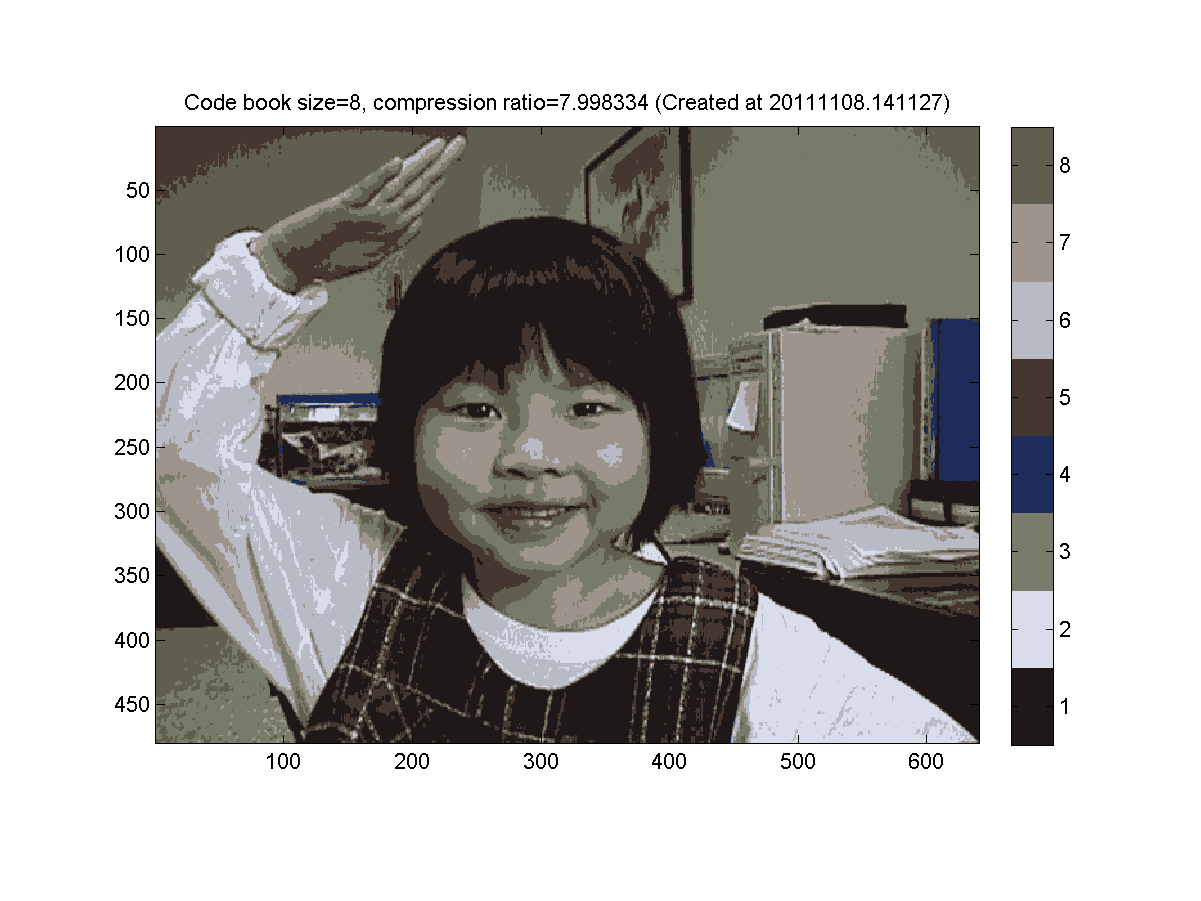
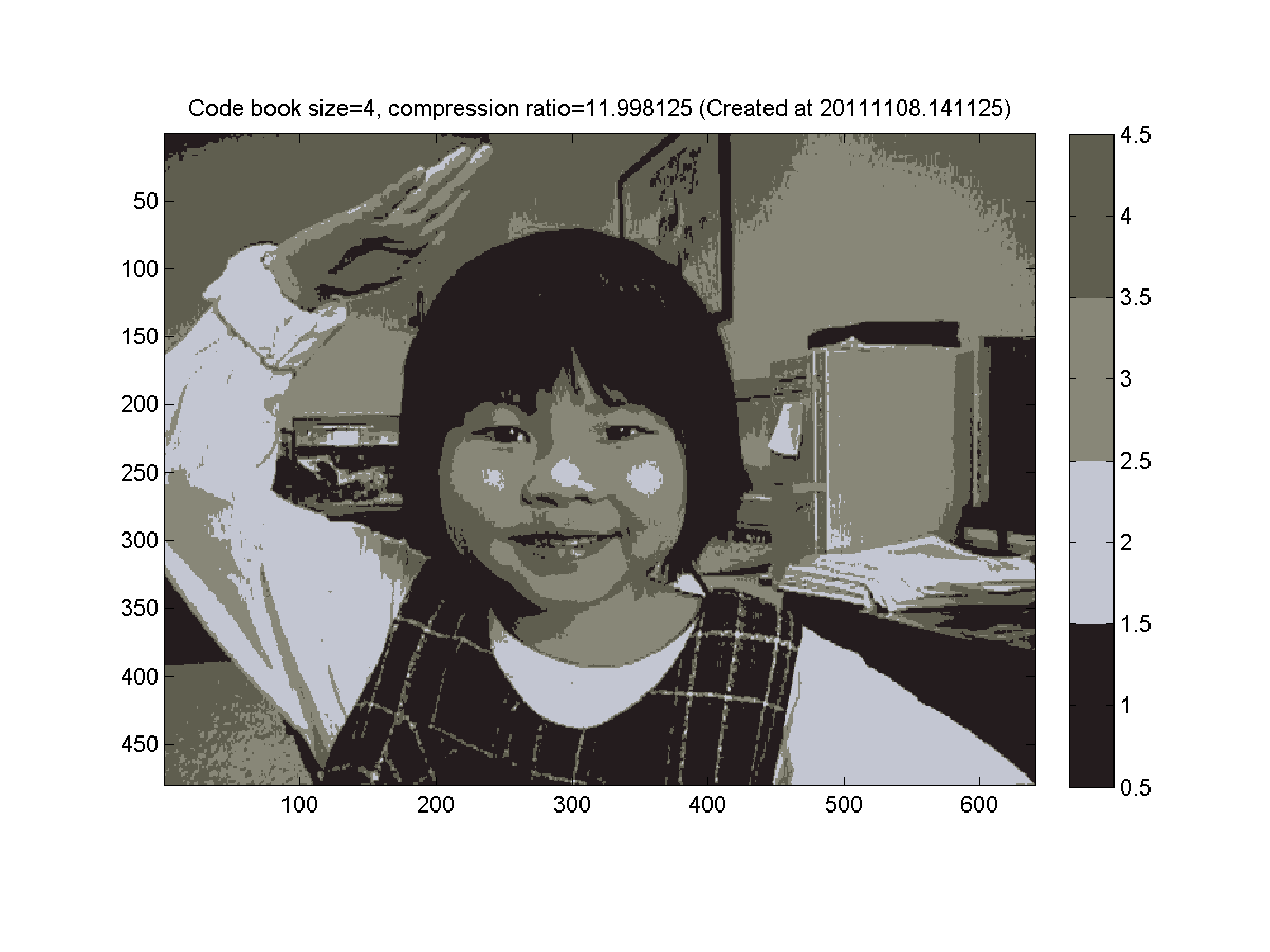
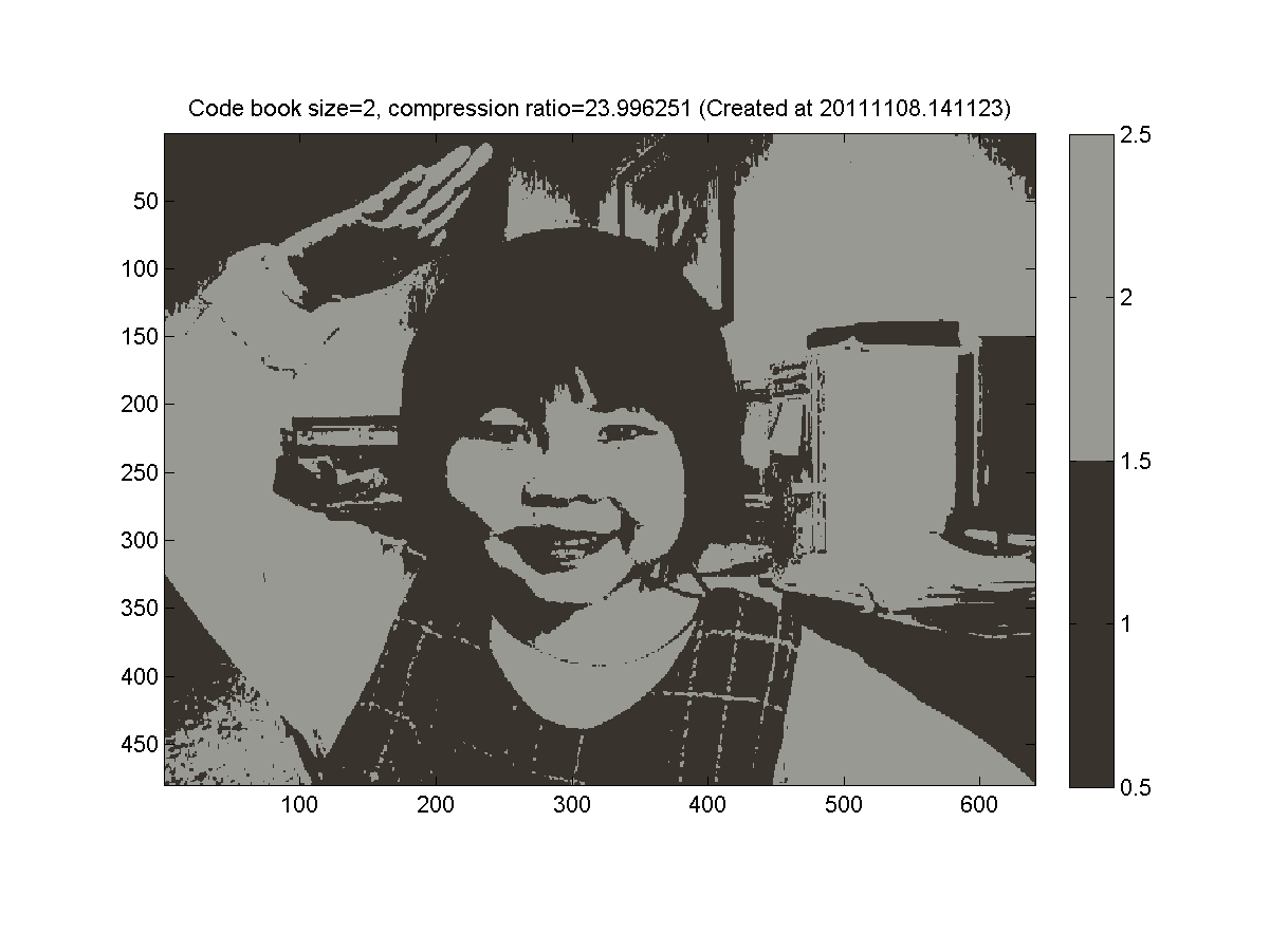
Example 3: k-means image compression
k-means image compression
Here is a simple example of how \(k\)-means can be used to reduce color space and compress data.
Consider the following image.
Each color in the image is represented by an integer.
Typically we might use 24 bits for each integer (8 bits for R, G, and B).
Now find \(k=16\) clusters of pixels in three dimensional \((R, G, B)\) space and replace each pixel by its cluster center.
Because there are 16 centroids, we can represent by a 4-bit mapping for a compression ratio of \(24/4=6\times\).
Here we cluster into 8 groups (3 bits) for a compression ratio \(24/3=8\times\).
Here we cluster into 4 groups (2 bits) for a compression ratio around \(24/2=12\times\).
Finally, we use 1 bit (2 color groups) for a compression ratio of \(24\times\).
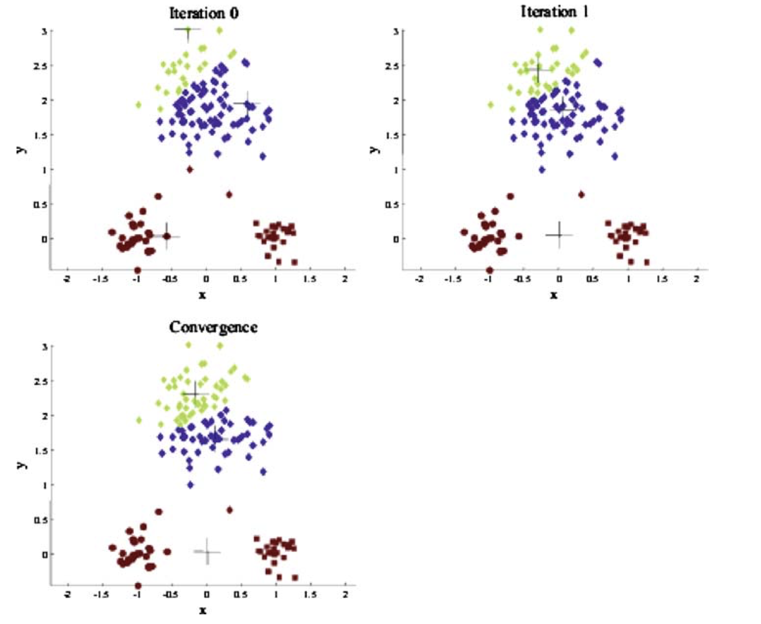
In-Class Activity: k-Means Clustering
Time: 10 minutes Materials: Pencil and paper Objective: Understand the k-means algorithm through 1D visualization
Activity: “Clustering 1D Data”
The Data
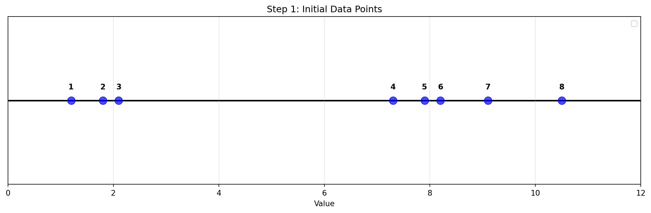
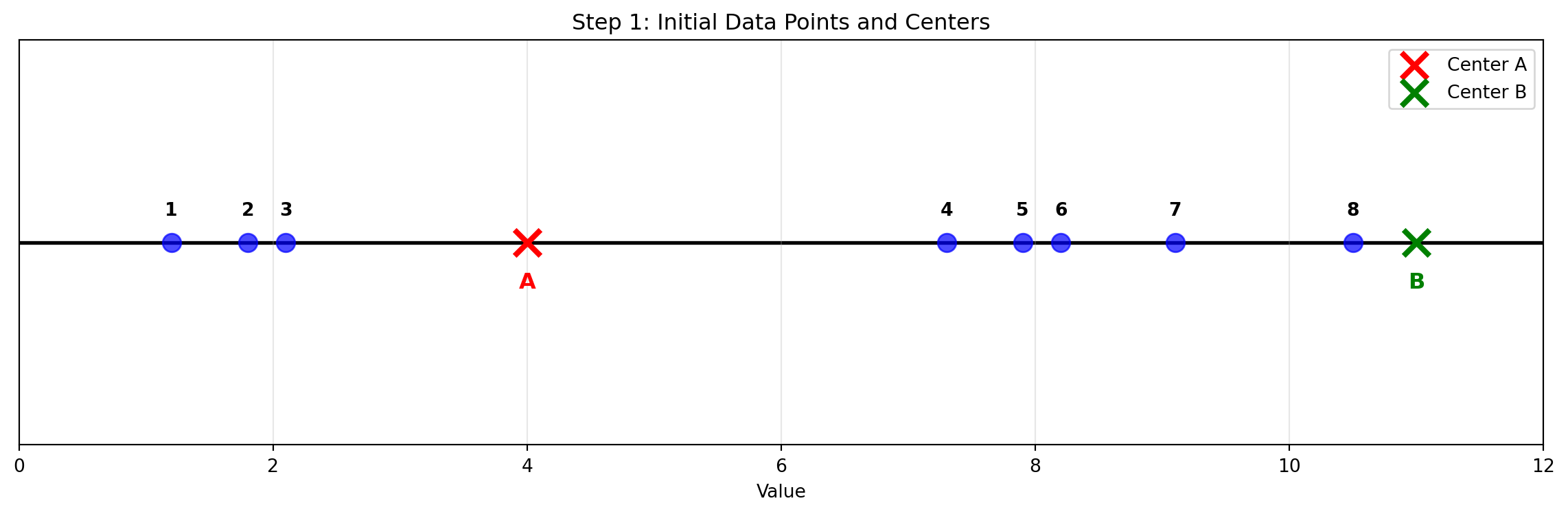
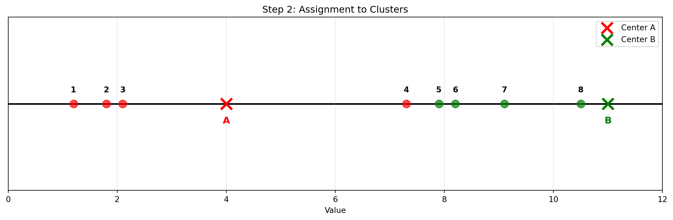
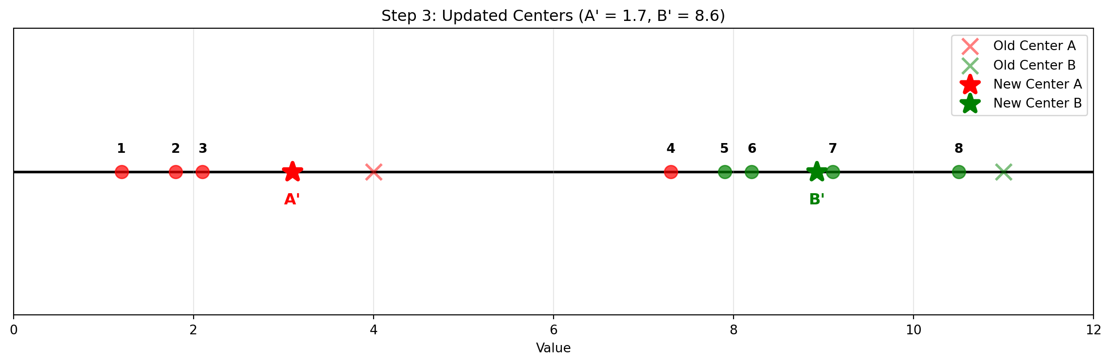
We have 8 data points on a number line that form 2 natural clusters:
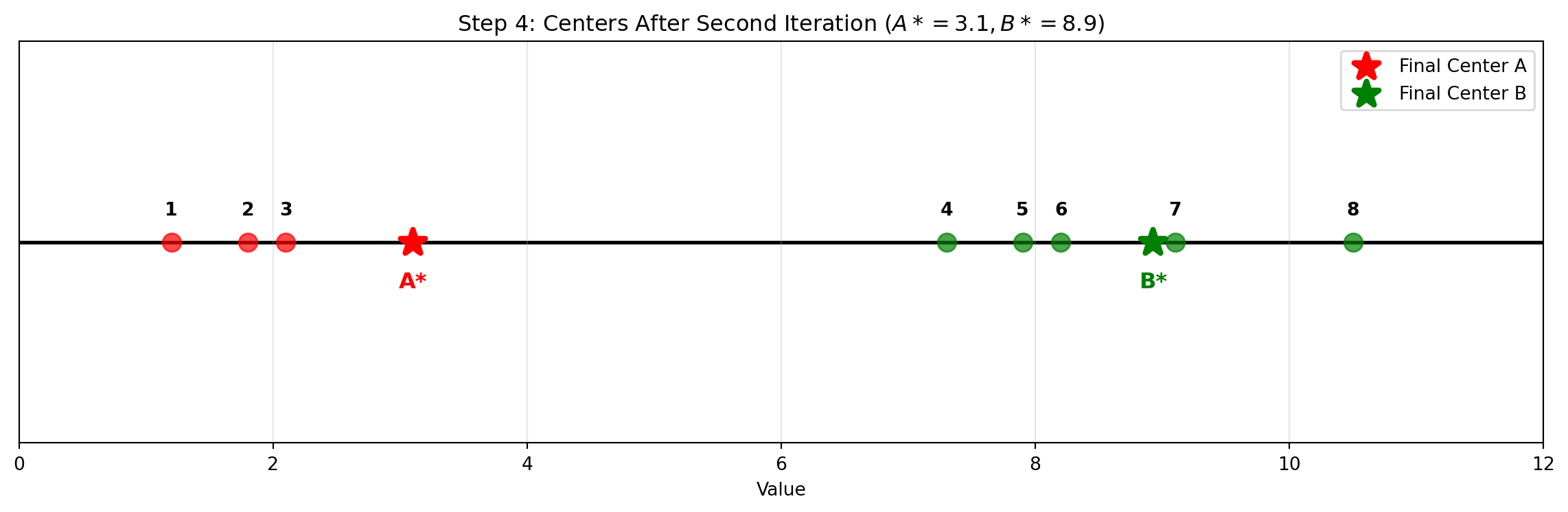
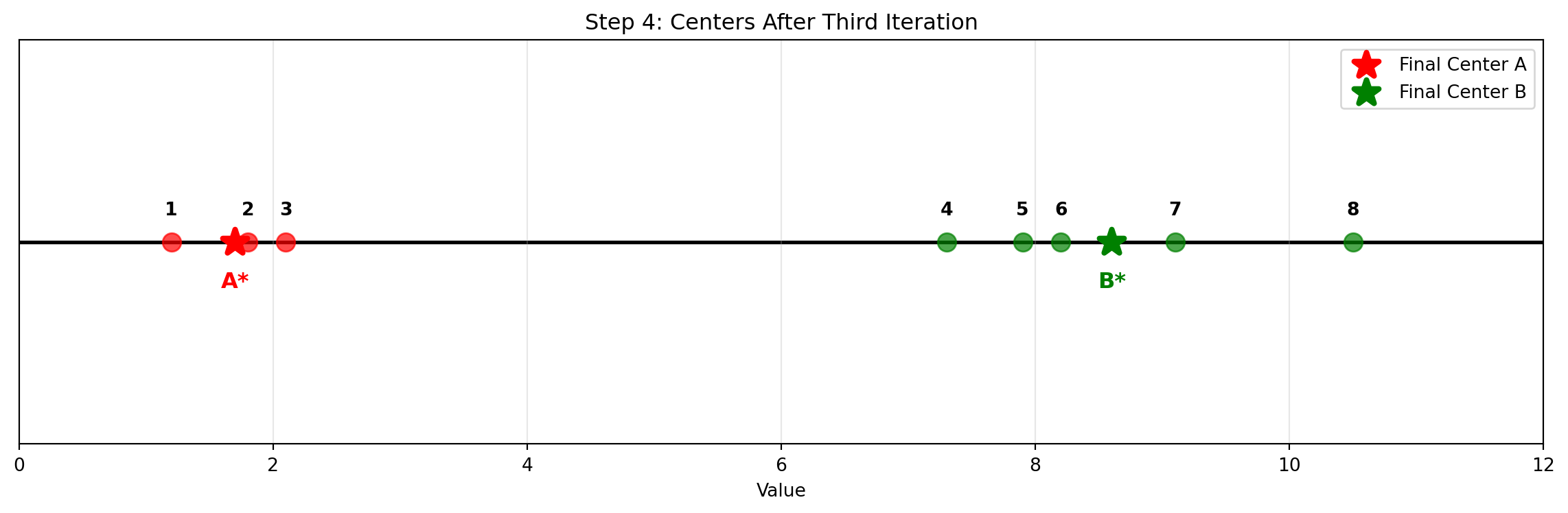
Data Points: 1.2, 1.8, 2.1, 7.3, 7.9, 8.2, 9.1, 10.5
Code
# Data pointsdata_points = np.array([1.2, 1.8, 2.1, 7.3, 7.9, 8.2, 9.1, 10.5])# Create the plotfig, ax = plt.subplots(figsize=(12, 4))# Plot data points with numbersfor i, point inenumerate(data_points): ax.scatter(point, 0, s=100, c='blue', alpha=0.7, zorder=3) ax.annotate(f'{i+1}', (point, 0), xytext=(0, 15), textcoords='offset points', ha='center', fontsize=10, fontweight='bold')# Add horizontal x-axis lineax.axhline(y=0, color='black', linewidth=2, zorder=1)# Formattingax.set_xlim(0, 12)ax.set_ylim(-0.5, 0.5)ax.set_xlabel('Value')ax.set_title('Step 1: Initial Data Points')ax.grid(True, alpha=0.3)ax.set_yticks([])ax.legend(loc='upper right')plt.tight_layout()plt.show()
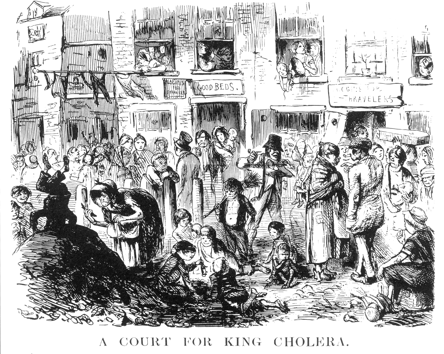
Public Domain, https://commons.wikimedia.org/w/index.php?curid=680455↩︎
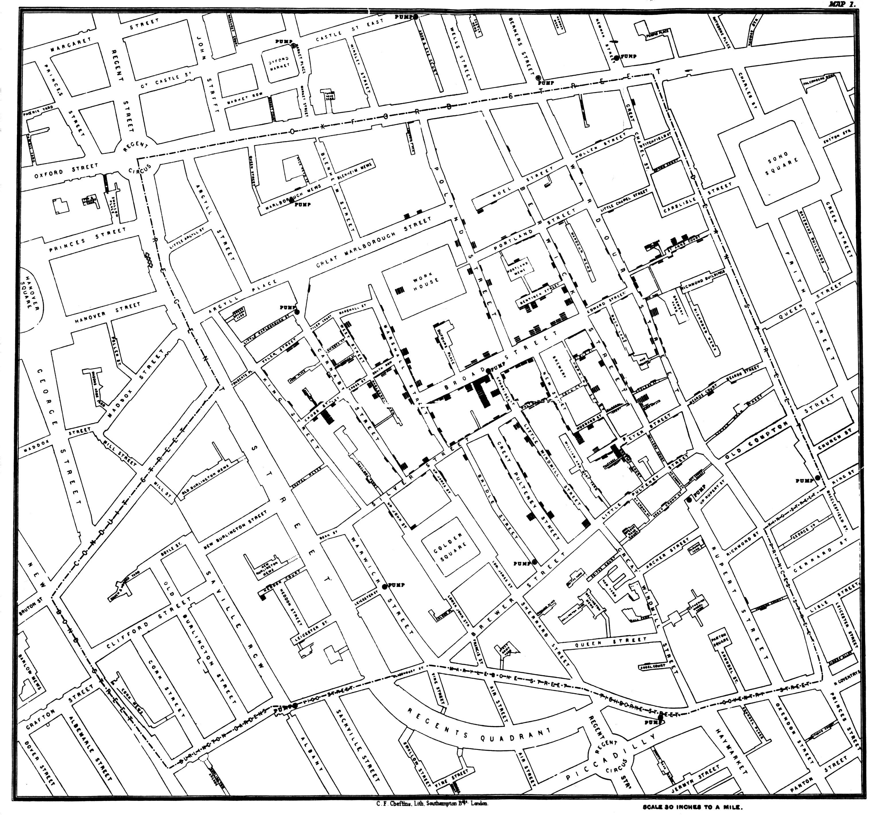
By John Snow - Published by C.F. Cheffins, Lith, Southhampton Buildings, London, England, 1854 in Snow, John. On the Mode of Communication of Cholera, 2nd Ed, John Churchill, New Burlington Street, London, England, 1855.↩︎
As determined at the 2006 IEEE International Conference on Data Mining↩︎