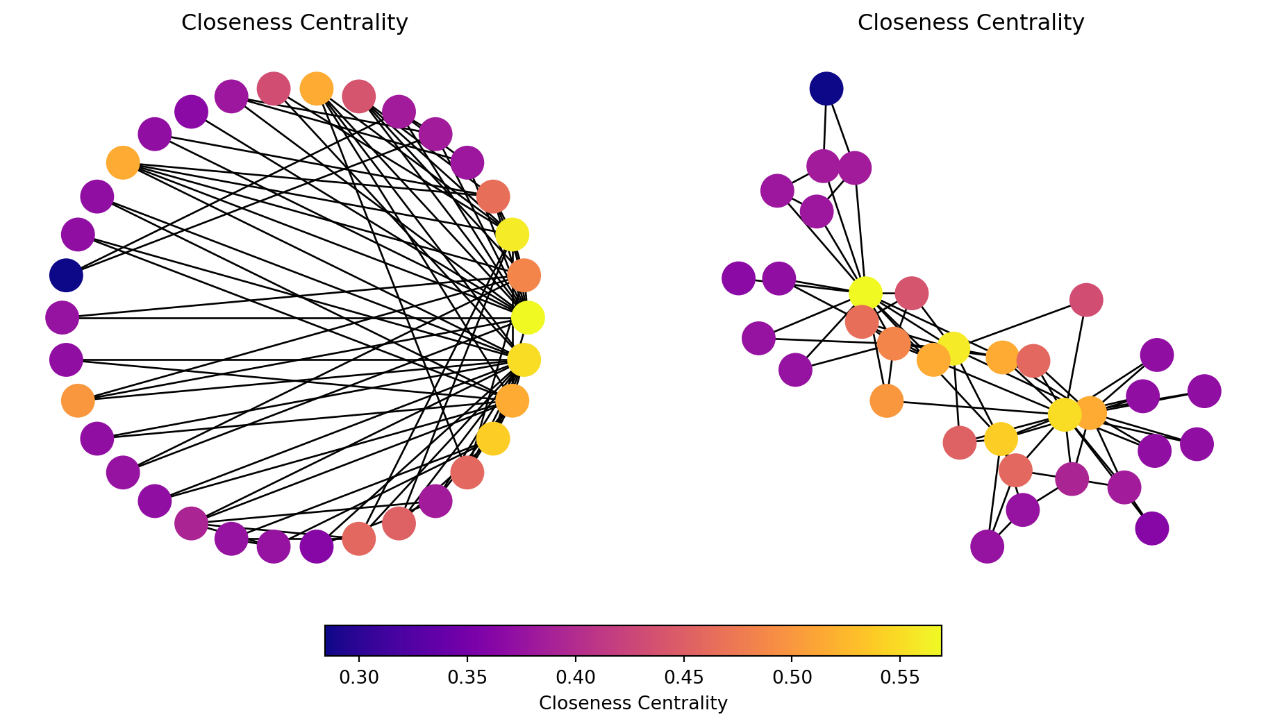
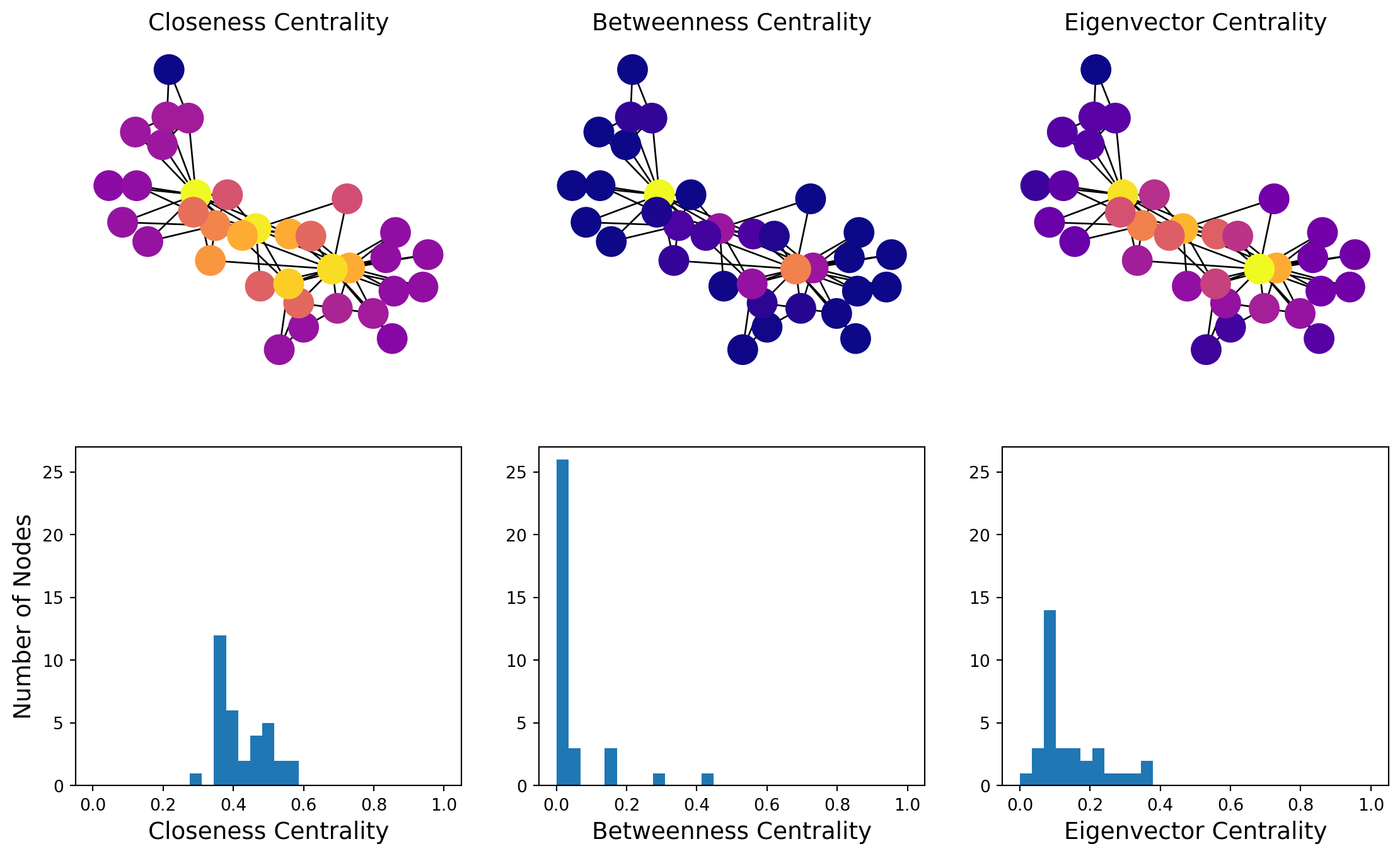
Indicates that a node is, on average, close to all other nodes in the network.
This means it can quickly interact with or reach other nodes.
Nodes with high closeness centrality are often considered central or influential because they can efficiently spread information or resources throughout the network.
Small Closeness Centrality:
Indicates that a node is, on average, farther away from all other nodes in the network.
These nodes are less central and may take longer to interact with or reach other nodes.
Nodes with low closeness centrality are often on the periphery of the network and are less influential in terms of spreading information or resources.
Code
# Assuming Gk is already defined as a graph# Calculate closeness centralitycent =list(nx.closeness_centrality(Gk).values())# Set random seed for reproducibilitynp.random.seed(9)# Create figure and subplotsfig, (ax1, ax2) = plt.subplots(1, 2, figsize=(10, 5))# Draw the first subplot with circular layoutpos1 = nx.circular_layout(Gk)nodes1 = nx.draw_networkx_nodes(Gk, pos=pos1, ax=ax1, node_color=cent, cmap=plt.cm.plasma)nx.draw_networkx_edges(Gk, pos=pos1, ax=ax1)ax1.set_title('Closeness Centrality')ax1.axis('off')# Draw the second subplot with spring layoutpos2 = nx.spring_layout(Gk)nodes2 = nx.draw_networkx_nodes(Gk, pos=pos2, ax=ax2, node_color=cent, cmap=plt.cm.plasma)nx.draw_networkx_edges(Gk, pos=pos2, ax=ax2)ax2.set_title('Closeness Centrality')ax2.axis('off')# Add colorbar to the figurecbar = fig.colorbar(nodes1, ax=[ax1, ax2], orientation='horizontal', fraction=0.05, pad=0.05)cbar.set_label('Closeness Centrality')# Show the plotplt.show()
In this graph, most nodes are close to most other nodes.
However we can see that some nodes are slightly more central than others.
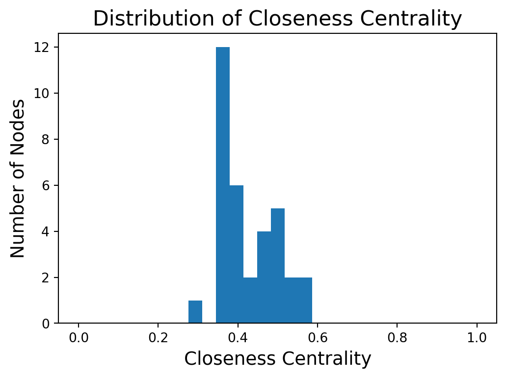
Distribution of Closeness Centrality
Code
plt.figure(figsize = (6, 4))plt.hist(cent, bins=np.linspace(0, 1, 30))plt.xlabel('Closeness Centrality', size =14)plt.ylabel('Number of Nodes', size =14)plt.title('Distribution of Closeness Centrality', size =16)plt.show()
Higher closeness centrality means closer to all other nodes.
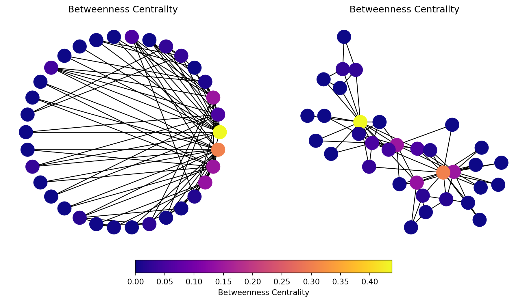
Betweenness Centrality
Alternatively we might be interested in the question, is the node on many paths?
Betweenness captures how important a node is to the communication process, or how much information passes through the node.
First, let’s consider the case in which there is only one shortest path between any pair of nodes.
Then, the betweenness centrality of node \(i\) is the number of shortest paths that pass through \(i\).
Mathematically we have
\[
\text{betweenness}(i) = \sum_{i \neq j \neq k \in V}
\begin{cases}
1 &\text{if path from }j\text{ to }k\text{ goes through }i, \\
0 &\text{otherwise}.
\end{cases}
\]
For a graph with \(n\) nodes, we can normalize this to a value between 0 and 1 by dividing by \({n \choose 2} = n(n-1)/2\).
General Case: Dependency
In a general graph, there may be multiple shortest paths between \(j\) and \(k\).
To handle this, we define:
\(\sigma(i \mid j,k)\) is the number of shortest paths between \(j\) and \(k\) that pass through \(i\), and
\(\sigma(j,k)\) is the total number of shortest paths between \(j\) and \(k\).
Then we define the dependency of \(i\) on the paths between \(j\) and \(k\) as the ratio of those two quantities:
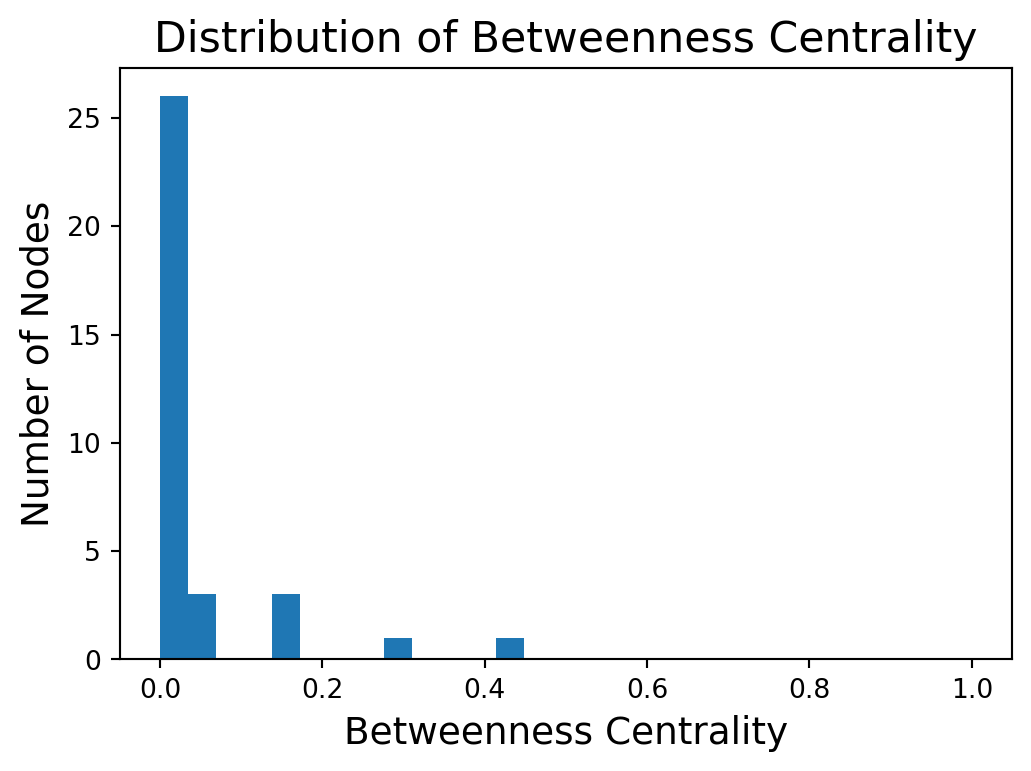
Note that many nodes will have a betweenness centrality of zero – no shortest paths go through them.
Code
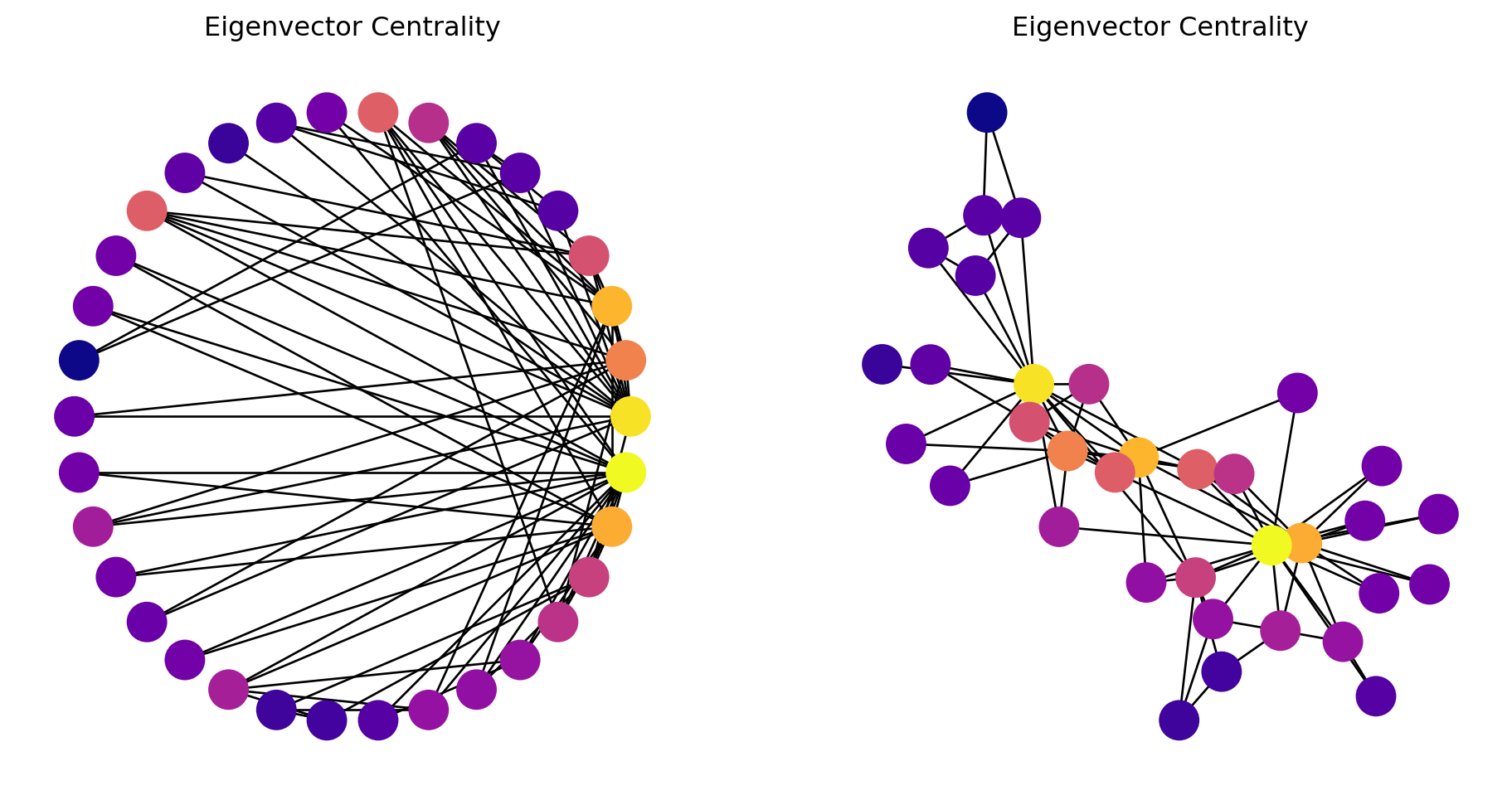
# Create the graphGk = nx.karate_club_graph()# Calculate betweenness centralitycent =list(nx.betweenness_centrality(Gk).values())# Set random seed for reproducibilitynp.random.seed(9)# Create figure and subplotsfig, (ax1, ax2) = plt.subplots(1, 2, figsize=(10, 5))# Draw the first subplot with circular layoutpos1 = nx.circular_layout(Gk)nodes1 = nx.draw_networkx_nodes(Gk, pos=pos1, ax=ax1, node_color=cent, cmap=plt.cm.plasma)nx.draw_networkx_edges(Gk, pos=pos1, ax=ax1)ax1.set_title('Betweenness Centrality')ax1.axis('off')# Draw the second subplot with spring layoutpos2 = nx.spring_layout(Gk)nodes2 = nx.draw_networkx_nodes(Gk, pos=pos2, ax=ax2, node_color=cent, cmap=plt.cm.plasma)nx.draw_networkx_edges(Gk, pos=pos2, ax=ax2)ax2.set_title('Betweenness Centrality')ax2.axis('off')# Add colorbar to the figurecbar = fig.colorbar(nodes1, ax=[ax1, ax2], orientation='horizontal', fraction=0.05, pad=0.05)cbar.set_label('Betweenness Centrality')# Show the plotplt.show()
We start to see with this metric the importance of two or three key members of the karate club.
Distribution of Betweenness
Code
plt.figure(figsize = (6, 4))plt.hist(cent, bins=np.linspace(0, 1, 30))plt.xlabel('Betweenness Centrality', size =14)plt.ylabel('Number of Nodes', size =14)plt.title('Distribution of Betweenness Centrality', size =16)plt.show()
The higher the betweenness centrality of a node, the more it is on many shortest paths.
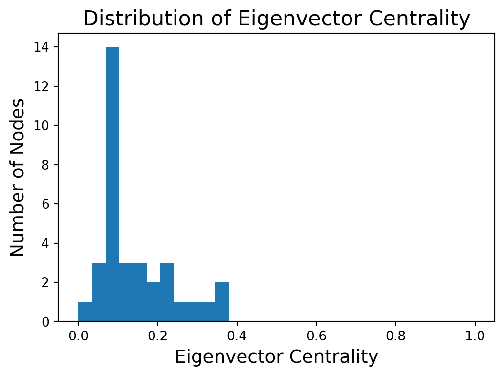
Eigenvector Centrality
Eigenvector centrality is a measure used in network analysis to determine the influence of a node within a network.
The centrality score of a node is proportional to the sum of the centrality scores of its neighbors.
The main idea of eigenvector (or status) centrality is that high status nodes are connected to high status nodes.
We calculate this with some matrix algebra.
Adjacency Matrices
First, represent the graphs by its adjacency matrix.
Given an \(n\)-node undirected graph \(G = (V, E)\), the adjacency matrix \(A\) is defined as
\(x_i\) is called the eigenvector centrality of node \(i\).
\(\lambda\) is a constant (which we’ll show is an eigenvalue).
Put another way, the importance of node \(i\) is proportional to the sum of the importance of the other nodes \(j\) directly connected to \(i\).
Matrix Form
In matrix form, this can be written as
\[
\mathbf{Ax} = \lambda \mathbf{x},
\]
where \(\mathbf{x}\) is the eigenvector corresponding to the the eigenvalue \(\lambda\) of the adjacency matrix \(\mathbf{A}\).
The eigenvector \(\mathbf{x}\) gives the centrality scores for all nodes in the network.
In general, there may be multiple eigenvalues \(\lambda\) for which the above equation holds.
In practice, the largest eigenvalue is used because it captures the most significant mode of influence propagation in the network.
Geometric Intuition
Eigenvector as a direction:
The eigenvector is a direction in the network space. Applying the adjacency matrix (representing connections between nodes) to this vector, stretches the vector along that direction. The amount of stretch is determined by the eigenvalue.
High centrality, high stretch:
A node with a large eigenvector centrality corresponds to an eigenvector that experiences a large stretch when transformed by the adjacency matrix. This indicates that it is connected to many other nodes that are also considered high-status.
No direction change:
The eigenvector doesn’t change its direction when transformed, only its magnitude. This means that a node with a high eigenvector centrality remains relatively central even when considering its connections to other central nodes.
Key Points on Eigenvector Centrality
Eigenvector: The vector \(\mathbf{x}\) represents the centrality scores.
Largest Eigenvalue: The centrality scores are derived from the eigenvector corresponding to the largest eigenvalue of the adjacency matrix.
Perron-Frobenius Theorem: For a connected graph, the largest eigenvalue is positive. In addition, there is only 1 corresponding eigenvector with all positive entries.
The Perron-Frobenius Theorem is an important theoretical tool when working with adjacency matrices, which are by definition nonnegative and positive.
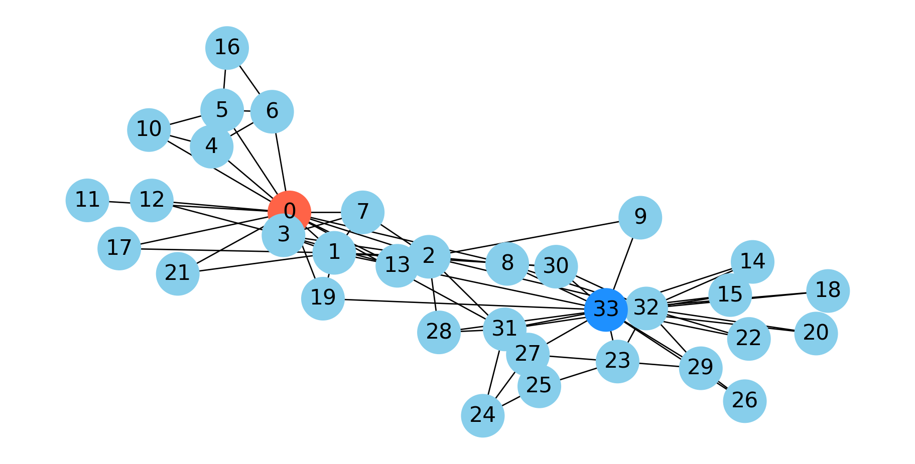
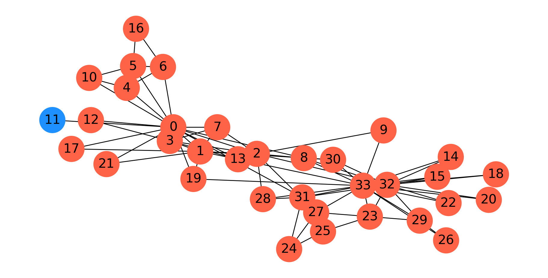
As mentioned, when Wayne Zachary studied the club, a conflict arose between the instructor and the president (nodes 0 and 33, respectively).
Zachary predicted the way the club would split based on an \(s\)-\(t\) min cut between the president and the instructor.
In fact, he correctly predicted every single member’s eventual association except for node 8.
Code
Gcopy = G.copy()Gcopy.remove_edges_from(cut_edges)cc = nx.connected_components(Gcopy)node_set = {node: i for i, s inenumerate(cc) for node in s}colors = ['dodgerblue', 'tomato']node_colors = [colors[node_set[v]-1] for v in G.nodes()]fig = plt.figure(figsize=(12, 5))nx.draw_networkx(G, node_color=node_colors, pos=pos, with_labels='True', node_size=1000, font_size=16)plt.axis('off')plt.show()
Minimum Cuts
In partitioning a graph, we may not have any particular \(s\) and \(t\) in mind.
Rather, we may want to simply find the minimal way to disconnect the graph.
Clearly, we can do this using an \(s\)-\(t\) min cut, by simply trying all \(s\) and \(t\) pairs.
Let’s try this approach of finding the minimum \(s-t\) cut over all possibilities in the karate club graph.
Code
Gcopy = G.copy()Gcopy.remove_edges_from(nx.minimum_edge_cut(G))cc = nx.connected_components(Gcopy)node_set = {node: i for i, s inenumerate(cc) for node in s}#colors = ['tomato', 'dodgerblue']node_colors = [colors[node_set[v]] for v in G]fig = plt.figure(figsize=(12,5))nx.draw_networkx(G, node_color=node_colors, pos=pos, with_labels='True', node_size=1000, font_size=16)plt.axis('off')plt.show()
This is in fact the minimum cut. Node 11 only has one edge to the rest of the graph, so the min cut is 1.
As this example shows, minimum cut is not, in general, a good approach for clustering or partitioning.
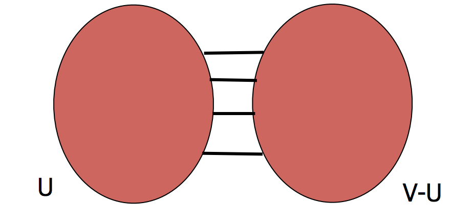
To get a more useful partition, we need to define a new goal. The new goal will be to find a balanced cut.
Balanced Cuts
The idea to avoid the problem above is to normalize the cut by the size of the smaller of the two components. The problem above would be avoided because the smaller of the two cuts is just a single node.
where \(E(U, V\setminus U)\) is the number of edges between the two parts.
The idea is that finding \(\alpha(G)\) gives a balanced cut – one that maximizes the number of disconnected nodes per edge removed.
Unfortunately, this is a challenging problem that is not computable in polynomial time.
However, we can make good approximations, which we’ll look at now.
To do so, we’ll introduce spectral graph theory.
Spectral Graph Theory
Spectral graph theory is the use of linear algebra to study the properties of graphs.
To introduce spectral graph theory, we define some terms.
Let \(G\) be an undirected graph with \(n\) nodes. We define the \(n\times n\) matrix \(D\) as a diagonal matrix of node degrees, i.e., \(D = \text{diag}(d_1, d_2, d_3, \dots)\) where \(d_i\) is the degree of node \(i\).
Assuming \(G\) has adjacency matrix \(A\), we define the Laplacian of \(G\) as
\[
L = D - A.
\]
Where the matrix has positive entries on the diagonal and negative, symmetric entries off the diagonal.
If you want to study this in more detail, some excellent references are
Now, taking into account the values in \(L\), we see that in the sum we will have the term \(d_i x_i^2\) for each \(i\), and also 2 terms of \(-x_ix_j\) whenever \((i,j)\in E\).
We constrain \(\mathbf{x}\) to have a nonzero norm (e.g. \(\Vert \mathbf{x}\Vert = 1\)), otherwise \(\mathbf{x} = \mathbf{0}\) would be a trivial solution.
We can express this in terms of the graph Laplacian:
Note that \(\mathbf{x} \perp {\mathbf 1}\) means that the sum of the entries in \(\mathbf{x}\) is zero, which implies that \(\mathbf{x}\) is mean-centered.
Fiedler Vector
The corresponding eigenvector to \(\lambda_2\) is called the Fiedler vector.
If we think of \(x_i\) as a 1-D coordinate for node \(i\) in the graph, then choosing \(\mathbf{x} = \mathbf{w}_2\) (the eigenvector corresponding to \(\lambda_2\)) puts each node in a position that minimizes the sum of the squared stretching of each edge.
Recall from physics that the energy in a stretched spring is proportional to the square of its stretched length.
If we use the entries in \(\mathbf{w}_2\) to position the nodes of the graph along a single dimension, then using the Fiedler vector \(\mathbf{w}_2\) for node coordinates is exactly the spring layout of nodes that we discussed in the last lecture – except that it is in one dimension only.
This is the basis for the spectral layout that we showed in the last lecture.
In the spectral layout, we use \(\mathbf{w}_2\) for the first dimension, and \(\mathbf{w}_3\) for the second dimension.
\(\mathbf{w}_3\) is the eigenvector corresponding to
What is the difference between the spectral layout and the spring layout?
In one dimension, they are the same, but in multiple dimensions, the spectral layout optimizes each dimension separately.
Spectral Partitioning
This leads to key ideas in node partitioning.
The basic idea is to partition nodes according to the Fiedler vector \(\mathbf{w}_2\).
This can be shown to have provably good performance for the balanced cut problem.
See Spectral and Algebraic Graph Theory by Daniel Spielman, Chapter 20, where it is proved that for every \(U \subset V\) with \(|U| \leq |V|/2\), \(\alpha(G) \geq \lambda_2 (1-s)\) where \(s = |U|/|V|\). In particular, \(\alpha(G) \geq \lambda_2/2.\)
There are a number of options for how to split based on the Fiedler vector.
If \(\mathbf{w}_2\) is the Fiedler vector, then split nodes according to a value \(s\):
bisection: \(s\) is the median value in \(\mathbf{w}_2\)
sign: separate positive and negative vaues (\(s = 0\))
gap: separate according to the largest gap in the values of \(\mathbf{w}_2\)
ratio cut: \(s\) is the value that maximizes \(\alpha\)
Example: Bisection Method
Consider a graph with 8 nodes where the Fiedler vector has values (sorted for convenience):
Ratio cut approach: Choose \(s\) that maximizes \(\alpha\)
The actual implementation searches over possible cut values to find the optimal partition quality.
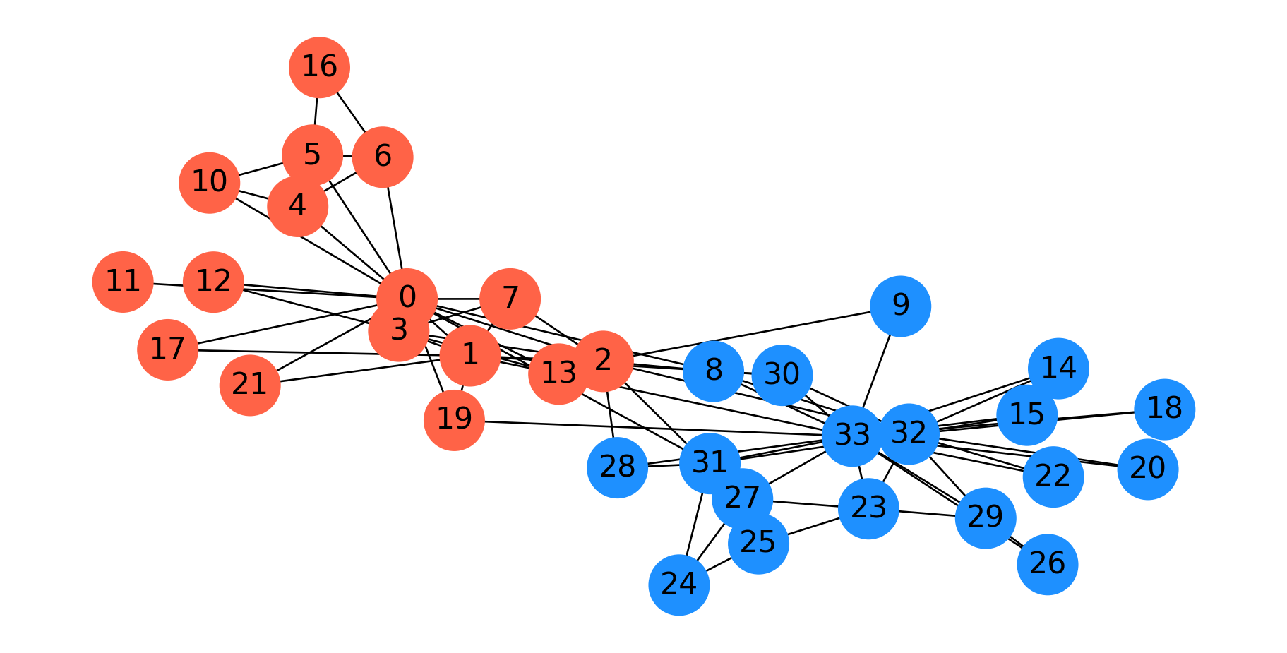
Here is a spectral parititioning for the karate club graph.
Code
G = nx.karate_club_graph()f = nx.fiedler_vector(G)s = np.zeros(len(f), dtype='int')s[f >0] =1#fig = plt.figure(figsize=(12,5))colors = ['tomato', 'dodgerblue']np.random.seed(9)pos = nx.spring_layout(G)node_colors = [colors[s[v]] for v in G]nx.draw_networkx(G, pos=pos, node_color=node_colors, with_labels='True', node_size=1000, font_size=16)plt.axis('off')plt.show()
Interestingly, this is almost the same as the \(s\)-\(t\) min cut based on the president and instructor.
Spectral Clustering
In many cases we would like to move beyond graph partitioning, to allow for clustering nodes into, say, \(k\) clusters.
The idea of spectral clustering takes the observations about the Fiedler vector and extends them to more than one dimension.
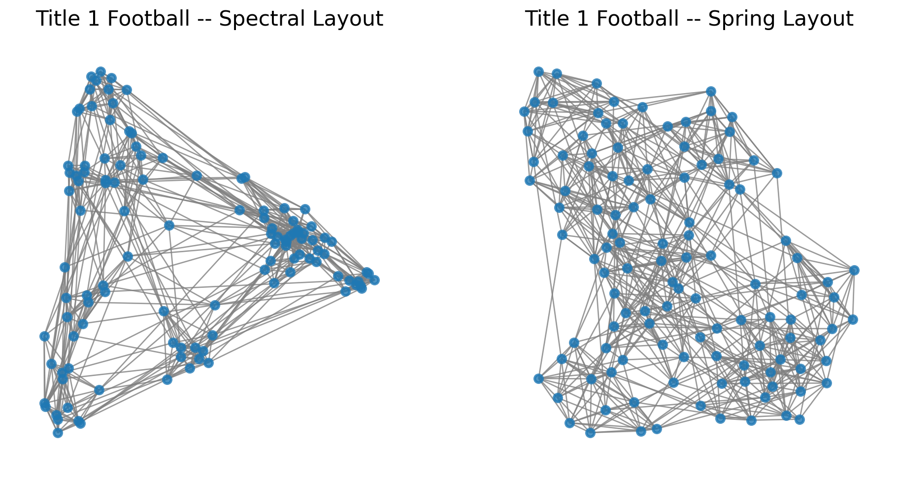
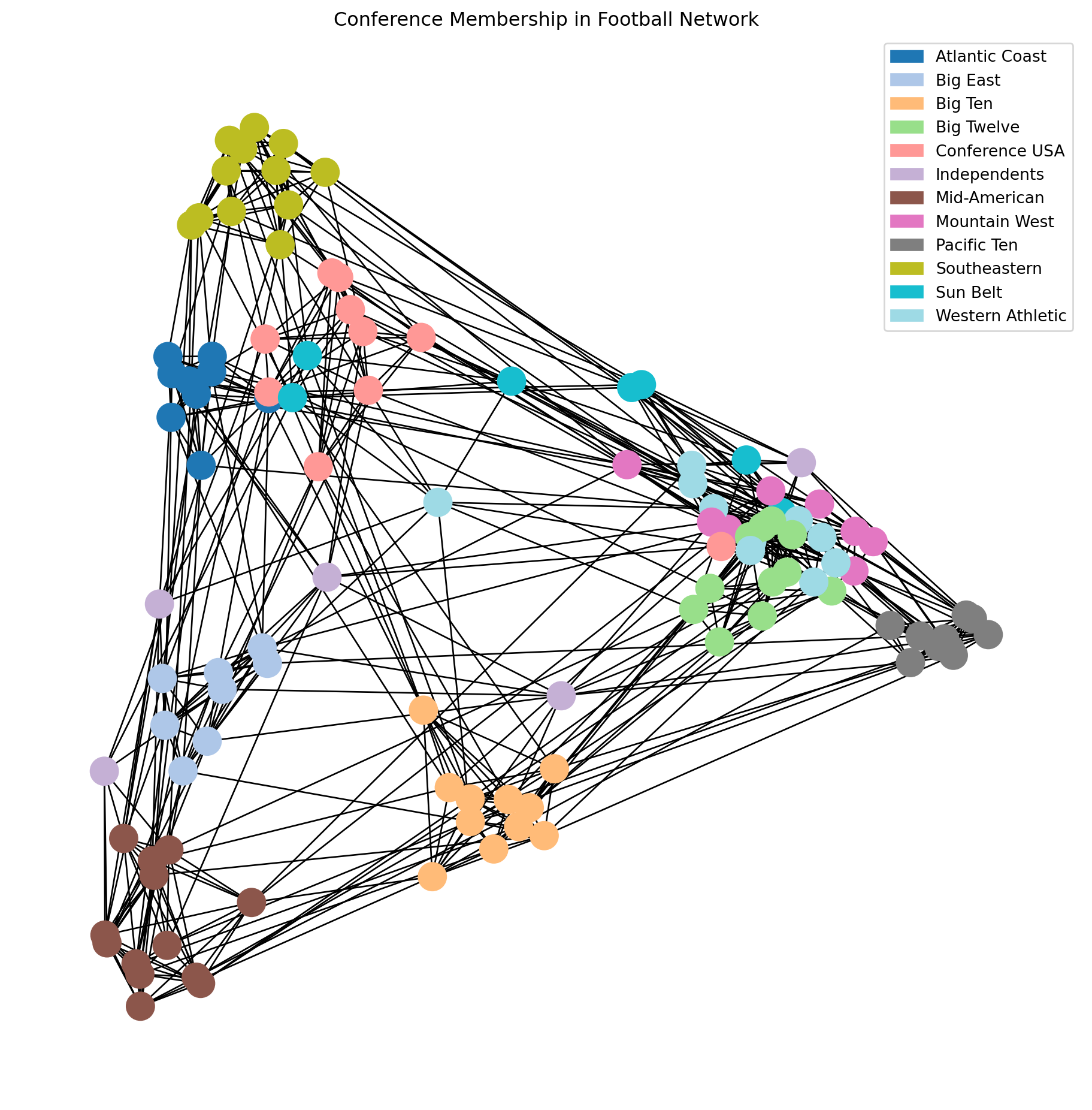
Let’s look again at the spectral layout of the football dataset.
Spectral Clustering: Example
Here we’ve labelled the nodes according to their conference, which we will think of as ground-truth labels.
Code
import matplotlib.patches as mpatchesimport recmap = plt.cm.tab20## data from http://www-personal.umich.edu/~mejn/netdata/football = nx.readwrite.gml.read_gml('data/football.gml')conf_name = {}withopen('data/football.txt', 'r') as fp:for line in fp: m = re.match(r'\s*(\d+)\s+=\s*([\w\s-]+)\s*\n', line)if m: conf_name[int(m.group(1))] = m.group(2)conf = [d['value'] for i, d in football.nodes.data()]##plt.figure(figsize = (8, 8))nx.draw_networkx(football, pos = nx.spectral_layout(football), node_color = conf, with_labels =False, cmap = cmap)plt.title('Conference Membership in Football Network')patches = [mpatches.Patch(color = cmap(i/11), label = conf_name[i]) for i inrange(12)]plt.legend(handles = patches)plt.axis('off')plt.show()
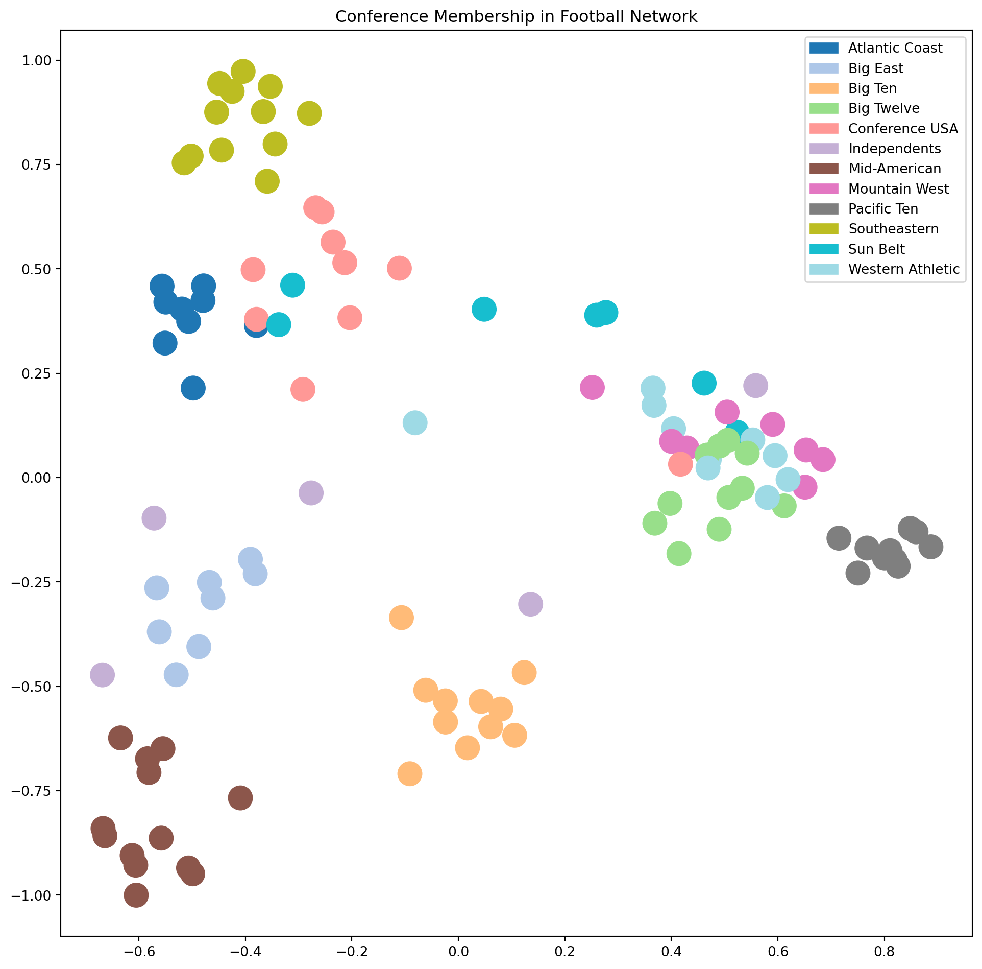
Now, the key idea is that using the spectral layout, we have placed nodes into a Euclidean space.
This means we could use a standard clustering algorithm in that space.
Code
plt.figure(figsize = (12, 10))nx.draw_networkx(football, pos = nx.spectral_layout(football), node_color = conf, with_labels =False, edgelist = [], cmap = cmap)plt.title('Conference Membership in Football Network')patches = [mpatches.Patch(color = cmap(i/11), label = conf_name[i]) for i inrange(12)]plt.tick_params(left=True, bottom=True, labelleft=True, labelbottom=True)plt.legend(handles = patches)plt.show()
This plot shows that many clusters are well-separated in this space, but some still overlap.
To address this, we can use additional eigenvectors of the Laplacian, i.e., \(\mathbf{w}_4, \mathbf{w}_5, \dots\).
The idea of spectral clustering is:
use enough of the smallest eigenvectors of \(L\) to sufficiently “spread out” the nodes,
cluster the nodes in the Euclidean space created by this embedding.
More specifically, given a graph \(G\):
Compute \(L\), the Laplacian of \(G\)
Compute the smallest \(d\) eigenvectors of \(L\), excluding the smallest eigenvector (the ones vector)
Let \(U \in \mathbb{R}^{n\times d}\) be the matrix containing the eigenvectors \(\mathbf{w}_2, \mathbf{w}_3, \dots, \mathbf{w}_{d+1}\) as columns
Let the position of each node \(i\) be the point in \(\mathbb{R}^d\) given by row \(i\) of \(U\)
Cluster the points into \(k\) clusters using \(k\)-means
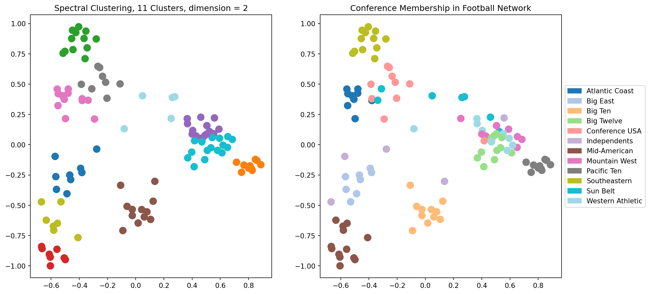
Let’s explore the results of spectral clustering using \(d = 2\) dimensions.
Code
# Here is a complete example of spectral clustering## The number of dimensions of spectral layoutk =2## Obtain the graphfootball## Compute the eigenvectors of its LaplacianL = nx.laplacian_matrix(football).todense()w, v = np.linalg.eig(L)v = np.array(v)# # scale each eigenvector by its eigenvalueX = v @ np.diag(w)## consider the eigenvectors in increasing order of their eigenvaluesw_order = np.argsort(w)X = X[:, w_order]## run kmeans using k top eigenvectors as coordinatesfrom sklearn.cluster import KMeanskmeans = KMeans(init='k-means++', n_clusters=11 , n_init=10)kmeans.fit_predict(X[:, 1:(k+1)])centroids = kmeans.cluster_centers_labels = kmeans.labels_error = kmeans.inertia_## visualize the resultplt.figure(figsize = (14, 7))ax1 = plt.subplot(121)nx.draw_networkx(football, ax = ax1, pos = nx.spectral_layout(football), node_color = labels, with_labels =False, edgelist = [], cmap = cmap, node_size =100)plt.tick_params(left=True, bottom=True, labelleft=True, labelbottom=True)plt.title(f'Spectral Clustering, 11 Clusters, dimension = {k}')ax2 = plt.subplot(122)nx.draw_networkx(football, ax = ax2, pos = nx.spectral_layout(football), node_color = conf, with_labels =False, edgelist = [], cmap = cmap, node_size =100)plt.title('Conference Membership in Football Network')patches = [mpatches.Patch(color = cmap(i/11), label = conf_name[i]) for i inrange(12)]plt.tick_params(left=True, bottom=True, labelleft=True, labelbottom=True)plt.legend(handles = patches, loc='center left', bbox_to_anchor=(1, 0.5))plt.show()
This is pretty good, but we can see that in some cases the clustering is not able to separate clusters that overlap in the visualization.
Which makes sense, as for the case \(d = 2\), we are running \(k\)-means on the points just as we see them in the visualization.
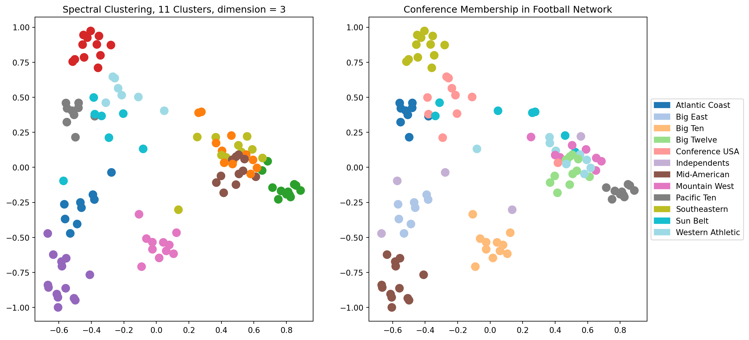
Let’s try \(d = 3\). Now there will be another dimension available to the clustering, which we can’t see in the visualization.
Code
# Here is a complete example of spectral clustering## The number of dimensions of spectral layoutk =3### Compute the eigenvectors of its LaplacianL = nx.laplacian_matrix(football).todense()w, v = np.linalg.eig(L)v = np.array(v)# # scale each eigenvector by its eigenvalueX = v @ np.diag(w)## consider the eigenvectors in increasing order of their eigenvaluesw_order = np.argsort(w)X = X[:, w_order]## run kmeans using k top eigenvectors as coordinatesfrom sklearn.cluster import KMeanskmeans = KMeans(init='k-means++', n_clusters=11 , n_init=10)kmeans.fit_predict(X[:, 1:(k+1)])centroids = kmeans.cluster_centers_labels = kmeans.labels_error = kmeans.inertia_## visualize the resultplt.figure(figsize = (14, 7))ax1 = plt.subplot(121)nx.draw_networkx(football, ax = ax1, pos = nx.spectral_layout(football), node_color = labels, with_labels =False, edgelist = [], cmap = cmap, node_size =100)plt.tick_params(left=True, bottom=True, labelleft=True, labelbottom=True)plt.title(f'Spectral Clustering, 11 Clusters, dimension = {k}')ax2 = plt.subplot(122)nx.draw_networkx(football, ax = ax2, pos = nx.spectral_layout(football), node_color = conf, with_labels =False, edgelist = [], cmap = cmap, node_size =100)plt.title('Conference Membership in Football Network')patches = [mpatches.Patch(color = cmap(i/11), label = conf_name[i]) for i inrange(12)]plt.tick_params(left=True, bottom=True, labelleft=True, labelbottom=True)plt.legend(handles = patches, loc='center left', bbox_to_anchor=(1, 0.5))plt.show()
We can see visually that using 3 dimensions is giving us a better clustering than 2 dimensions.
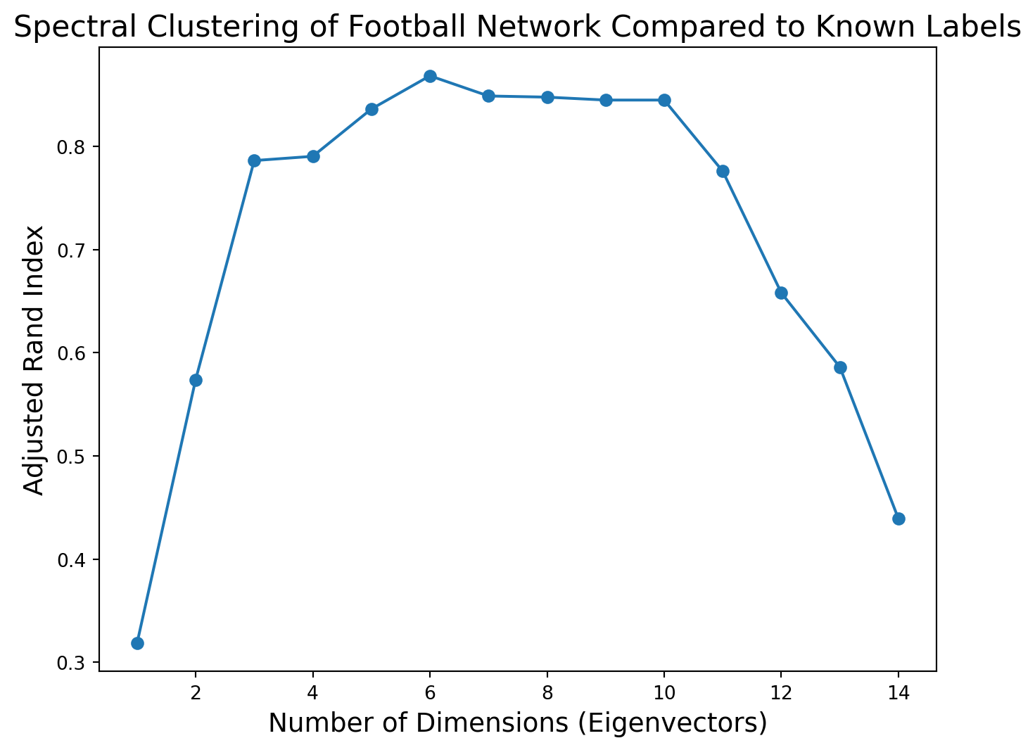
What happens as we increase the dimension further?
To evaluate this question we can use Adjusted Rand Index.
ARI Spectral Clustering
Code
import sklearn.metrics as metrics## Compute the eigenvectors of its LaplacianL = nx.laplacian_matrix(football).todense()w, v = np.linalg.eig(L)v = np.array(v)# # scale each eigenvector by its eigenvalueX = v @ np.diag(w)## consider the eigenvectors in increasing order of their eigenvaluesw_order = np.argsort(w)X = X[:, w_order]#max_dimension =15ri = np.zeros(max_dimension -1)for k inrange(1, max_dimension):# run kmeans using k top eigenvectors as coordinates kmeans = KMeans(init='k-means++', n_clusters =11, n_init =10) kmeans.fit_predict(X[:, 1:(k+1)]) ri[k -1] = metrics.adjusted_rand_score(kmeans.labels_, conf)#plt.figure(figsize = (8, 6))plt.plot(range(1, max_dimension), ri, 'o-')plt.xlabel('Number of Dimensions (Eigenvectors)', size =14)plt.title('Spectral Clustering of Football Network Compared to Known Labels', size =16)plt.ylabel('Adjusted Rand Index', size =14)plt.show()
Based on this plot, it appears that the football graph can be best described as approximately six-dimensional.
When we embed it in six dimensions and cluster there we get an extremely high Adjusted Rand Index.
Code
print(f'Maximum ARI is {np.max(ri):0.3f}, using {1+ np.argmax(ri)} dimensions for spectral embedding.')
Maximum ARI is 0.868, using 6 dimensions for spectral embedding.
Recap
Networks are present in many interesting applications.
We have covered the following topics
Graph representations
Cluster coefficients
Centrality measures
Clustering – (see notes)
In addition we used the NewtorkX package to visualize our networks in the following formats