We will demonstrate the relationship between PCA and the SVD.
t-SNE is an alternative nonlinear method for dimensionality reduction.
PCA
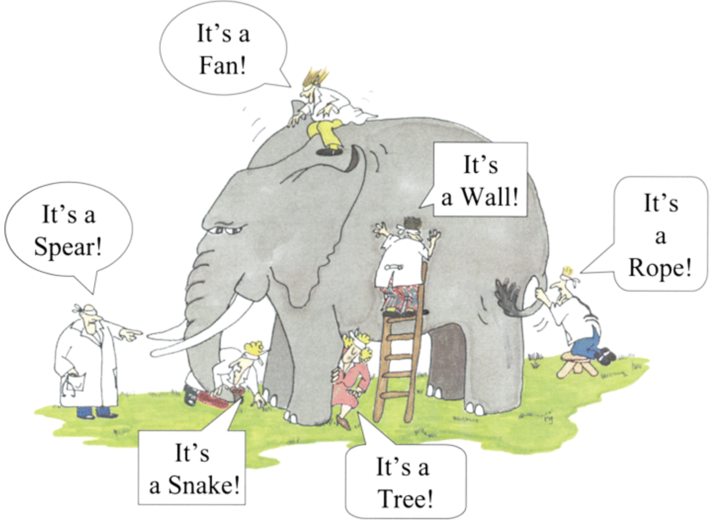
Dimensionality Reduction
Input: \(\mathbf{x}_1,\ldots, \mathbf{x}_m\) with \(\mathbf{x}_i \in \mathbb{R}^n \: \: \forall \: i \in \{1, \ldots, n\}.\)
Output: \(\mathbf{y}_1,\dots, \mathbf{y}_m\) with \(\mathbf{y}_i \in \mathbb{R}^d \: \: \forall \: i \in \{1, \dots, n\}\).
The goal is to compute the new data points \(\mathbf{y}_i\) such that \(d << n\) while still preserving the most information contained in the data points \(\mathbf{x}_i\).
Be aware that row i of the data matrix \(X_0\) is the \(n\) dimensional vector \(\mathbf{x}_i\). This keeps our matrix in the structure \(m\) data rows and \(n\) features (columns). The same is true for \(Y\) (i.e., there are \(m\) rows with \(d\) features).
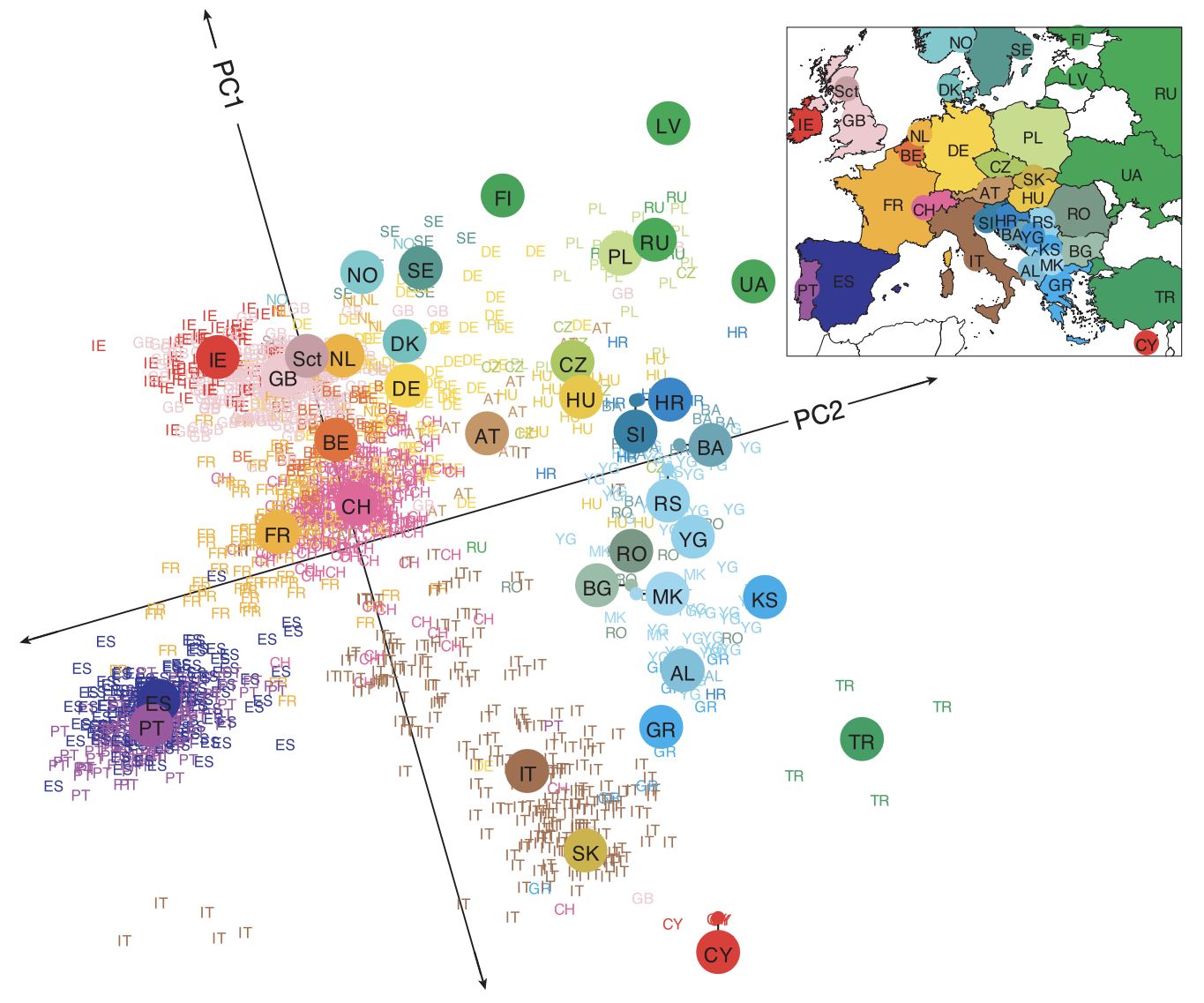
We consider a dataset from Novembre et al. (2008). The authors collected DNA data called SNPs (single nucleotide polymorphism) from 3000 individuals in Europe.
SNPs describe the changes in DNA from a common base pair (A,T,C,G). A value of 0 means no changes to the base pair, a value of 1 means 1 change to the base pair, and a value of 2 means both base pairs change.
The data for each individual consisted of approximately 500k SNPs. This means the data matrix we are working with is 3000 x 500k.
The authors performed PCA and plotted 1387 of the individuals in the reduced dimensions.
The matrix \(S\) is symmetric, i.e., \(S = S^{T}.\)
Understanding the Formula
The formula is: \[S = \frac{1}{m-1}X^{T}X\]
where \(X\in\mathbb{R}^{m\times n}\) contains centered data.
Key Setup
First, let’s understand what \(X\) represents:
\(m\) rows = number of observations/samples
\(n\) columns = number of features/variables
Centered data means each column has mean 0 (we’ve subtracted the column mean from each entry)
So if we denote the columns of \(X\) as vectors, we have: \[X = \begin{bmatrix} | & | & & | \\ \mathbf{x}_1 & \mathbf{x}_2 & \cdots & \mathbf{x}_n \\ | & | & & | \end{bmatrix}\]
where each \(\mathbf{x}_j \in \mathbb{R}^m\) is a centered column vector (mean = 0).
What Does \(X^T X\) Compute?
When we compute \(X^T X\):
Dimensions: \((n \times m) \cdot (m \times n) = n \times n\)
The \((i,j)\) entry of \(X^T X\) is: \((\mathbf{x}_i)^T \mathbf{x}_j = \sum_{k=1}^{m} x_{ki} \cdot x_{kj}\)
This is the dot product between column \(i\) and column \(j\) of \(X\).
Why This Gives Covariance
The sample covariance between features \(i\) and \(j\) is defined as: \[\text{Cov}(i,j) = \frac{1}{m-1}\sum_{k=1}^{m}(x_{ki} - \bar{x}_i)(x_{kj} - \bar{x}_j)\]
But since the data is centered, we have \(\bar{x}_i = 0\) and \(\bar{x}_j = 0\), so: \[\text{Cov}(i,j) = \frac{1}{m-1}\sum_{k=1}^{m}x_{ki} \cdot x_{kj} = \frac{1}{m-1}(\mathbf{x}_i)^T \mathbf{x}_j\]
This is exactly the \((i,j)\) entry of \(\frac{1}{m-1}X^T X\)!
The Result
Therefore, \(S = \frac{1}{m-1}X^{T}X\) is an \(n \times n\) matrix where:
Diagonal entries\(S_{ii}\) = variance of feature \(i\)
Off-diagonal entries\(S_{ij}\) = covariance between features \(i\) and \(j\)
This is precisely the sample covariance matrix.
Note: The factor of \((m-1)\) instead of \(m\) gives us the unbiased sample estimator (Bessel’s correction).
Spectral Decomposition
We use the fact that the covariance matrix \(S\) is symmetric to apply the Spectral Decomposition, which states:
Every real symmetric matrix \(S\) has the factorization \(V\Lambda V^{T}\), where \(\Lambda\) is a diagonal matrix that contains the eigenvalues of S and the columns of \(V\) are orthogonal eigenvectors of \(S\).
This is a special case of eigendecomposition for symmetric matrices.
The direction \(\mathbf{v}_i\) is the \(i\)-th principal component and the corresponding \(\lambda_i\) accounts for the \(i\)-th largest variance in the dataset.
In other words, \(\mathbf{v}_1\) is the first principal component and is the direction that accounts for the most variance in the dataset.
The vector \(\mathbf{v}_d\) is the \(d\)-th principal component and is the direction that accounts for the \(d\)-th most variance in the dataset.
The reduced data matrix is obtained by computing
\[
Y = XV'.
\]
Spatial Interpretation – Dimensions
The operation \(Y = XV'\) performs a change of basis and projection of your data:
\(X \in \mathbb{R}^{m \times n}\): each of the \(m\) rows is a data point in the original \(n\)-dimensional feature space
\(V' \in \mathbb{R}^{n \times d}\): contains the first \(d\) principal components as columns (these are orthogonal vectors)
\(Y \in \mathbb{R}^{m \times d}\): each row is now a data point in the new \(d\)-dimensional space
Geometric Interpretation
Rotation: The multiplication by \(V'\) rotates your coordinate system. The columns of \(V'\) define a new set of \(d\) orthogonal axes that point in the directions of maximum variance.
Projection: Each data point in \(X\) is projected onto this new coordinate system. For each row vector \(\mathbf{x}_i\) (a point in \(\mathbb{R}^n\)): \[\mathbf{y}_i = \mathbf{x}_i V' = \begin{bmatrix} \mathbf{x}_i \cdot \mathbf{v}_1 & \mathbf{x}_i \cdot \mathbf{v}_2 & \cdots & \mathbf{x}_i \cdot \mathbf{v}_d \end{bmatrix}\]
Dimensionality Reduction: You’re effectively taking each point in \(n\)-dimensional space and expressing it using only \(d\) coordinates - the coordinates along the principal component directions. You’re discarding the components along directions with low variance.
Intuitive View
Think of it as finding the “best viewing angle” for your data. If you have data in 3D that’s mostly flat (like a pancake), PCA finds that the data lies approximately in a 2D plane. \(V'\) defines that plane’s orientation, and \(Y\) gives you the coordinates of each point within that plane.
What is the value of the total variance in the data?
Total variance: \(T = 100\).
The first principal component accounts for all the variance in this example dataset.
PCA Summary
The columns of \(V\) are the principal directions (or components).
The reduced dimension data is the projection of the data in the direction of the principal directions, i.e., \(Y=XV'\).
The total variance \(T\) in the data is the sum of all eigenvalues: \(T = \lambda_1 + \lambda_2 + \dots + \lambda_n.\)
The first eigenvector \(\mathbf{v}_1\) points in the most significant direction of the data. This direction explains the largest fraction \(\lambda_1/T\) of the total variance.
The second eigenvector \(\mathbf{v}_2\) accounts for a smaller fraction \(\lambda_2/T\).
The explained variance of component \(i\) is the value \(\lambda_i/T\). As \(i\rightarrow n\) the explained variance gets smaller and approaches \(\lambda_n/T\).
The cumulative (total) explained variance is the sum of the explained variances up to component \(k\), e.g. \(\sum_{i=1}^{k} \frac{\lambda_i}{T}\). The total explained variance for all eigenvalues is 1.
Case Study: Random Data
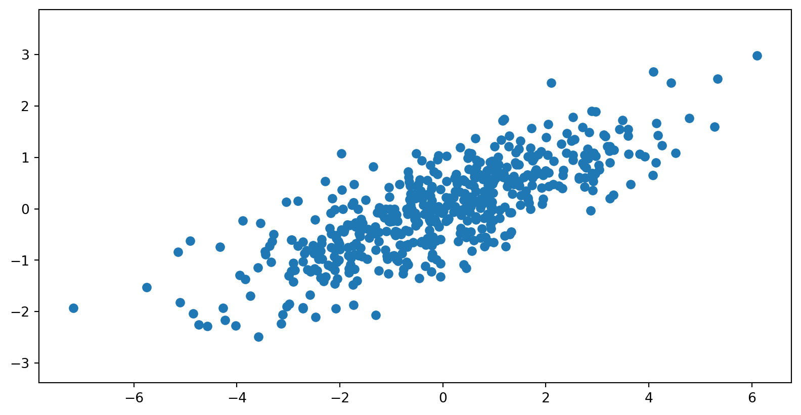
Let’s consider some randomly generated data consisting of 2 features.
Code
import numpy as npimport matplotlib.pyplot as pltrng = np.random.default_rng(seed=42)import numpy as np# Set the seed for reproducibilityseed =42rng = np.random.default_rng(seed)n_samples =500C = np.array([[0.1, 0.6], [2., .6]])X0 = rng.standard_normal((n_samples, 2)) @ C + np.array([-6, 3])X = X0 - X0.mean(axis=0)plt.scatter(X[:, 0], X[:, 1])plt.axis('equal')plt.show()
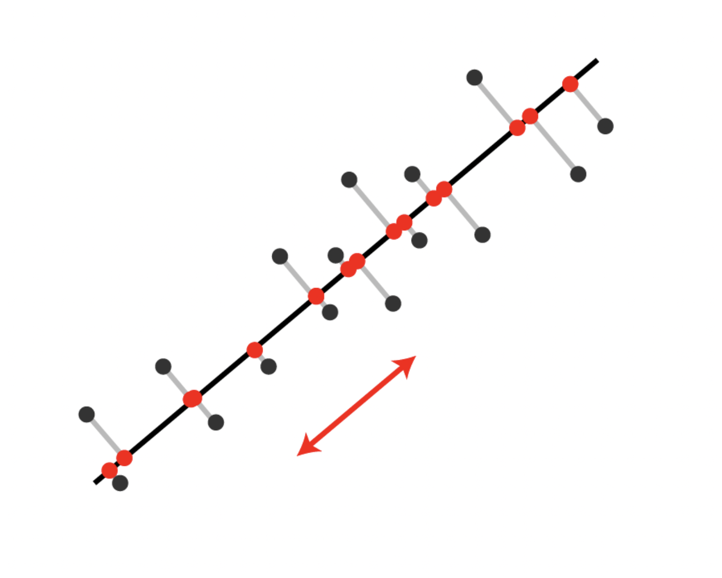
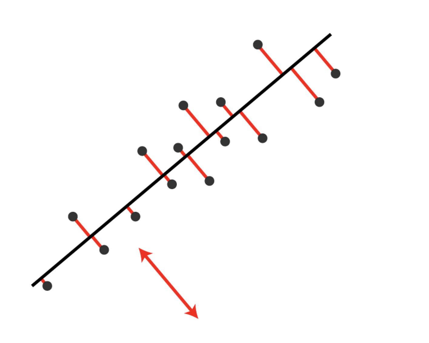
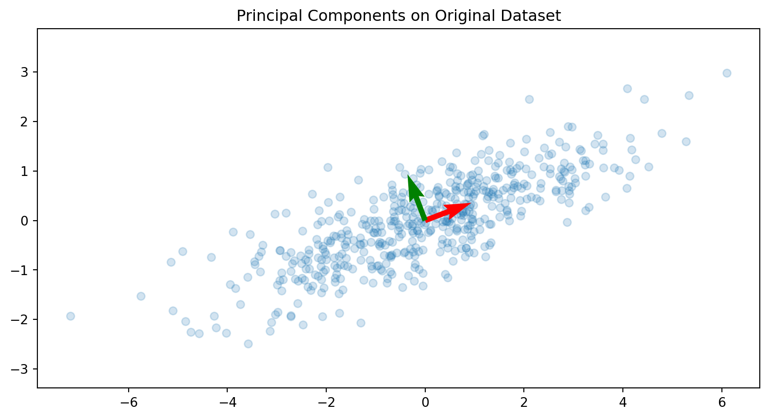
Let’s do PCA and plot the principle components over our dataset. As expected, the principal components are orthogonal and point in the directions of the maximum variance.
Code
import numpy as npimport matplotlib.pyplot as pltorigin = [0, 0]# Compute the covariance matrixcov_matrix = np.cov(X, rowvar=False)# Calculate the eigenvalues and eigenvectorseigenvalues, eigenvectors = np.linalg.eigh(cov_matrix)# Sort the eigenvalues and eigenvectors in descending ordersorted_indices = np.argsort(eigenvalues)[::-1]eigenvalues = eigenvalues[sorted_indices]eigenvectors = eigenvectors[:, sorted_indices]# Plot the original datasetplt.scatter(X[:, 0], X[:, 1], alpha=0.2)# Plot the principal componentsfor i inrange(len(eigenvalues)): plt.quiver(origin[0], origin[1], -eigenvectors[0, i], -eigenvectors[1, i], angles='xy', scale_units='xy', scale=1, color=['r', 'g'][i])plt.title('Principal Components on Original Dataset')plt.axis('equal')plt.show()
Case Study: Digits
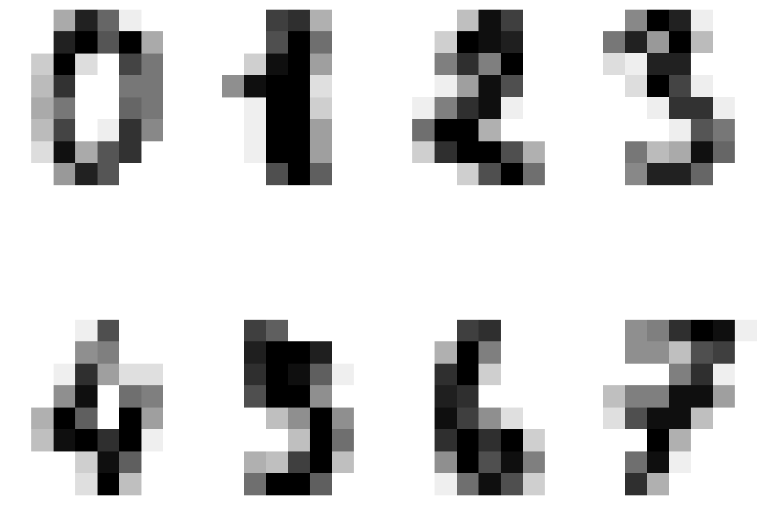
Let’s consider another example using the MNIST dataset.
Code
from sklearn import datasetsdigits = datasets.load_digits()plt.figure(figsize=(6, 6),)for i inrange(8): plt.subplot(2, 4, i +1) plt.imshow(digits.images[i], cmap='gray_r') plt.axis('off')plt.tight_layout()plt.show()
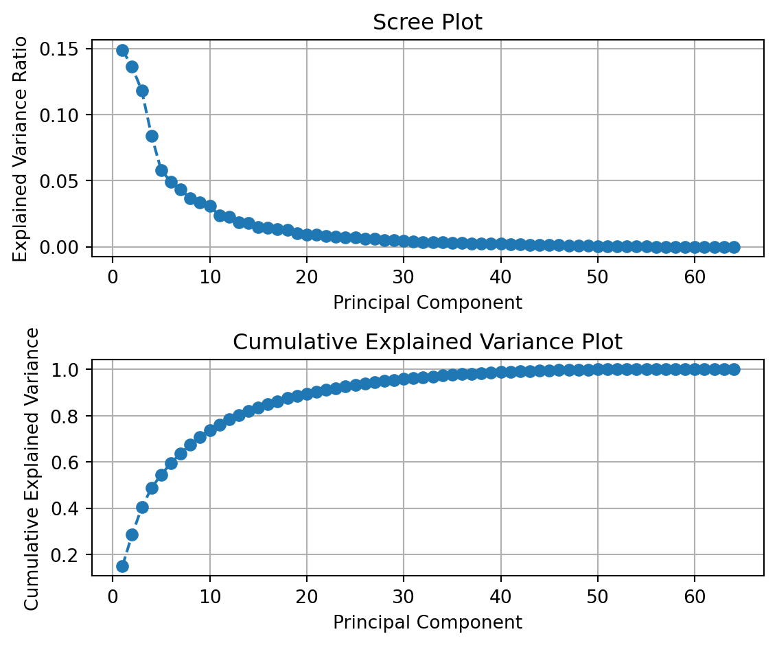
We first stack the columns of each digit on top of each other (this operation is called vectorizing) and perform PCA on the 64-D representation of the digits.
We can plot the explained variance ratio and the total (cumulative) explained variance ratio.
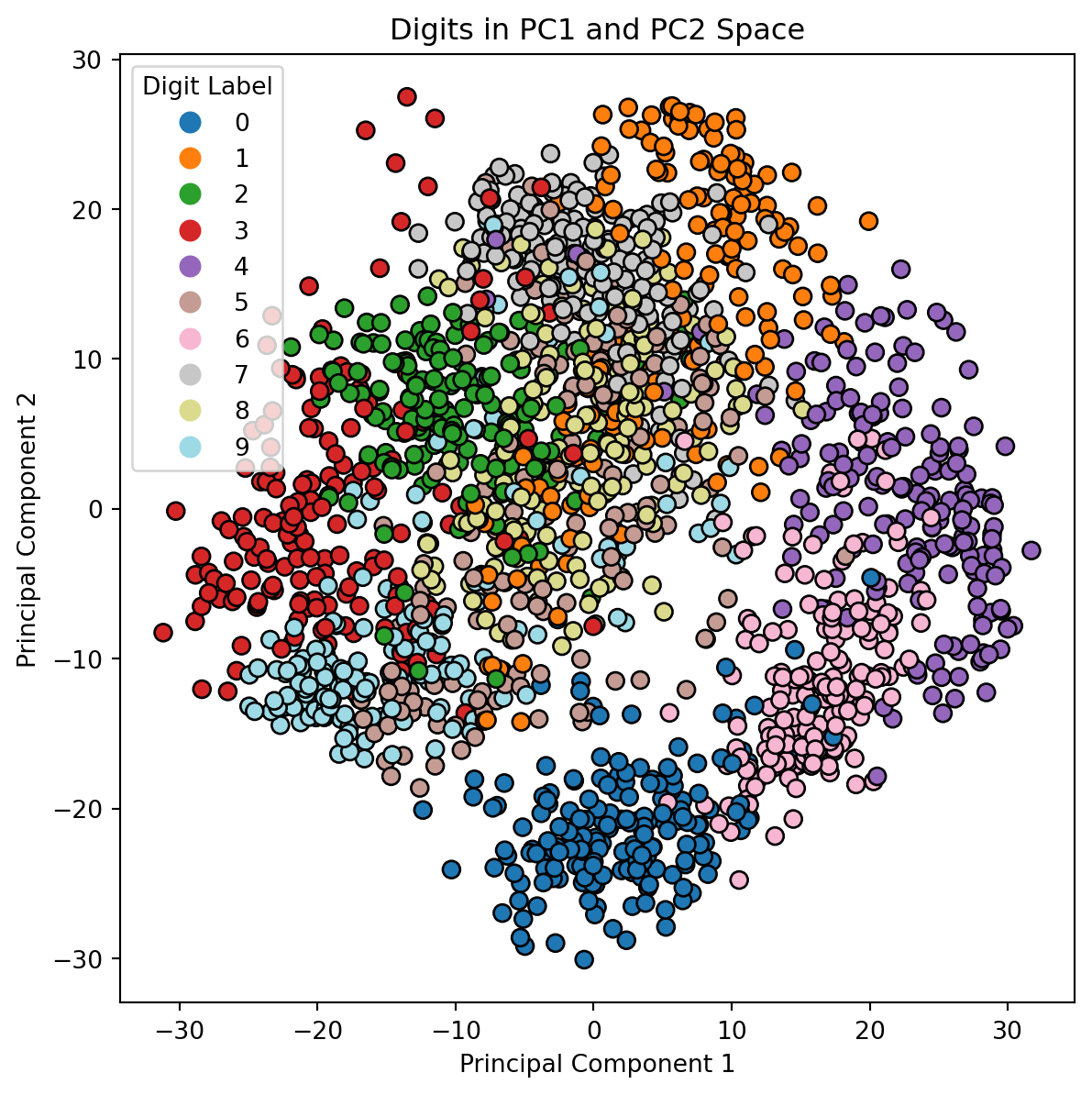
Let’s plot the data in the first 2 principal component directions. We’ll use the digit labels to color each digit in the reduced space.
Code
plt.figure(figsize=(5, 5))scatter = plt.scatter(X_pca[:, 0], X_pca[:, 1], c=y, cmap='tab20', edgecolor='k', s=50)plt.title('Digits in PC1 and PC2 Space')plt.xlabel('Principal Component 1')plt.ylabel('Principal Component 2')# Create a legend with discrete labelslegend_labels = np.unique(y)handles = [plt.Line2D([0], [0], marker='o', color='w', markerfacecolor=plt.cm.tab20(i /9), markersize=10) for i in legend_labels]plt.legend(handles, legend_labels, title="Digit Label", bbox_to_anchor=(1.05, 1), loc='upper left', borderaxespad=0.)plt.show()
We observe the following in our plot of the digits in the first two principal components:
There is a decent clustering of some of our digits, in particular 0, 2, 3, 4, and 6.
The numbers 0 and 6 seem to be relatively close to each other in this space.
There is not a very clear separation of the number 5 from some of the other points.
To scale or not to scale
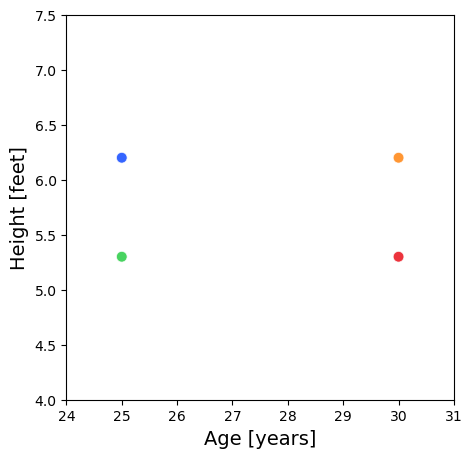
Consider a situation where we have age (years) and height (feet) data for 4 people.
Person
Age [years]
Height [feet]
A
25
6.232
B
30
6.232
C
25
5.248
D
30
5.248
Notice that the dominant direction of the variance is aligned horizontally.
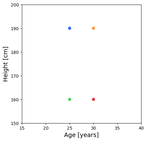
What if the height is in cm?
Person
Age [years]
Height [cm]
A
25
189.95
B
30
189.95
C
25
159.96
D
30
159.96
Notice that the dominant direction of the variance is aligned vertically.
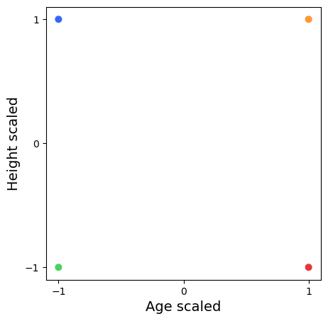
Let’s standardize our data.
Person
Age [years]
Height [cm]
A
-1
1
B
1
1
C
-1
-1
D
1
-1
When we normalize our data, we observe an equal distribution of the variance.
What quantity is represented by \(\frac{Cov(X, Y)}{\sigma_X\sigma_Y}\), where \(X\) and \(Y\) represent the random variables of a person’s age and height, respectively?
This is the correlation matrix. When you standardize your data you are no longer working with the covariance matrix but the correlation matrix.
PCA on a standardized dataset and working with the correlation matrix is the best practice when your data has very different scales.
PCA identifies the directions with the maximum variance and large scale data can disproportionately influence the results of your PCA.
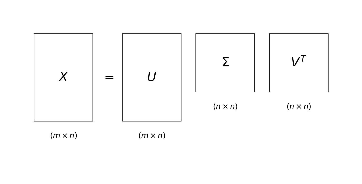
Relationship to the SVD
Recall that the SVD of a (mean-centered) data matrix \(X\in\mathbb{R}^{m\times n}\) (\(m>n\)) is
\[
X = U\Sigma V^T.
\]
How can we relate this to what we learned in PCA?
In PCA, we computed an eigen-decomposition of the covariance matrix, i.e., \(S=V\Lambda V^{T}\).
Consider the following computation using the SVD of \(X\)
We see that eigenvalues \(\lambda_i\) of the matrix \(S\) are the squares \(\sigma_{i}^{2}\) of the singular values \(\Sigma\) (scaled by \(\frac{1}{m-1}\)).
In practice, PCA is done by computing the SVD of your data matrix as opposed to forming the covariance matrix and computing the eigenvalues.
The principal components are the right singular vectors \(V\). The projected data is computed as \(XV\). The eigenvalues of \(S\) are obtained from squaring the entries of \(\Sigma\) and scaling them by \(\frac{1}{m-1}\).
Reasons to compute PCA this way are
Numerical Stability: SVD is a numerically stable method, which means it can handle datasets with high precision and avoid issues related to floating-point arithmetic errors.
Efficiency: SVD is computationally efficient, especially for large datasets. Many optimized algorithms and libraries (like those in NumPy and scikit-learn) leverage SVD for fast computations.
Direct Computation of Principal Components: SVD directly provides the principal components (right singular vectors) and the singular values, which are related to the explained variance. This makes the process straightforward and avoids the need to compute the covariance matrix explicitly.
Memory Efficiency: For large datasets, SVD can be more memory-efficient. Techniques like truncated SVD can be used to compute only the top principal components, reducing memory usage.
Versatility: SVD is a fundamental linear algebra technique used in various applications beyond PCA, such as signal processing, image compression, and solving linear systems. This versatility makes it a well-studied and widely implemented method.
Pros and Cons
Here are some advantages and disadvantages of using PCA.
Advantages
Allows for visualizations
Removes redundant variables
Prevents overfitting
Speeds up other ML algorithms
Disadvantages
reduces interpretability
can result in information loss
can be less effective than non-linear methods
t-SNE
What is t-SNE?
t-SNE stands for t-distributed Stochastic Neighbor Embedding
A dimensionality reduction technique specifically designed for visualization
Transforms high-dimensional data (hundreds or thousands of features) into 2D or 3D
Goal: Preserve the local structure of your data while making it viewable
Developed by Laurens van der Maaten and Geoffrey Hinton in 2008, see Van der Maaten and Hinton (2008).
Think of it as creating a “map” of your data where similar points stay close together.
Why Do We Need t-SNE?
The Curse of Dimensionality
Real datasets often have many features (dimensions)
Impossible to visualize data with 100+ dimensions
Traditional methods (like PCA) can lose important patterns
What t-SNE offers:
Reveals clusters and patterns in complex data
Preserves neighborhood relationships between points
Creates intuitive, interpretable visualizations
How Does t-SNE Work?
The Big Picture
Step 1: Measure Similarity in High Dimensions
Calculate how “similar” each pair of points is in the original space
Similar points get high probability, distant points get low probability
Step 2: Create a Random Low-Dimensional Map
Start with random positions for all points in 2D/3D
Step 3: Optimize the Map
Iteratively move points around to match the high-dimensional similarities
Points that were neighbors in high-D should be neighbors in low-D
Step 1: Compute Pairwise Similarities
Calculate pairwise similarities between points in the high-dimensional space.
Use a Gaussian distribution to convert distances into probabilities.
The probability \(p_{j\vert i}\) between points \(i\) and \(j\) is given by: \[
p_{j\vert i} = \frac{\exp(-\|x_i - x_j\|^2 / 2\sigma_i^2)}{\sum_{k \neq i} \exp(-\|x_i - x_k\|^2 / 2\sigma_i^2)}.
\]
The \(p_{j\vert i}\) value represents the conditional probability that point \(x_i\) would choose \(x_j\) as its neighbor.
Note that we set \(p_{i\vert i} = 0\) – we don’t consider a point to be its own neighbor.
To create symmetric joint probabilities, t-SNE combines these two conditional probabilities into a single joint probability \(p_{ij} = \frac{p_{j\vert i} + p_{i\vert j}}{2d}\) where \(d\) is the dimension of the point. This is because the probabilities \(p_{j\vert i}\) and \(p_{i\vert j}\) are different. Using this value of \(p_{ij}\) is called symmetric t-SNE.
Step 1: Choosing \(\sigma\)
The variance is calculated within a neighborhood of a point \(x_i\) determined by a hyperparameter called the perplexity.
As a result the perplexity controls the effective number of neighbors.
A high perplexity means more neighbors for each point. A low perplexity means less neighbors are considered for each point.
The perplexity is defined as \(\operatorname{Perp}(P_i) = 2^{H(P_i)}\), where \(H(P_i)\) is the entropy of \(P_i\). \(P_i\) is the probability distribution induced by \(\sigma_i\).
The entropy \(H(P_i) = -\sum_j p_{j\vert i} \log_2{(p_{j\vert i})}\).
The value for \(\sigma_i\) is computed to produce a distribution \(P_i\) which equals the chosen value of the perplexity.
The perplexity commonly ranges between 5 and 50.
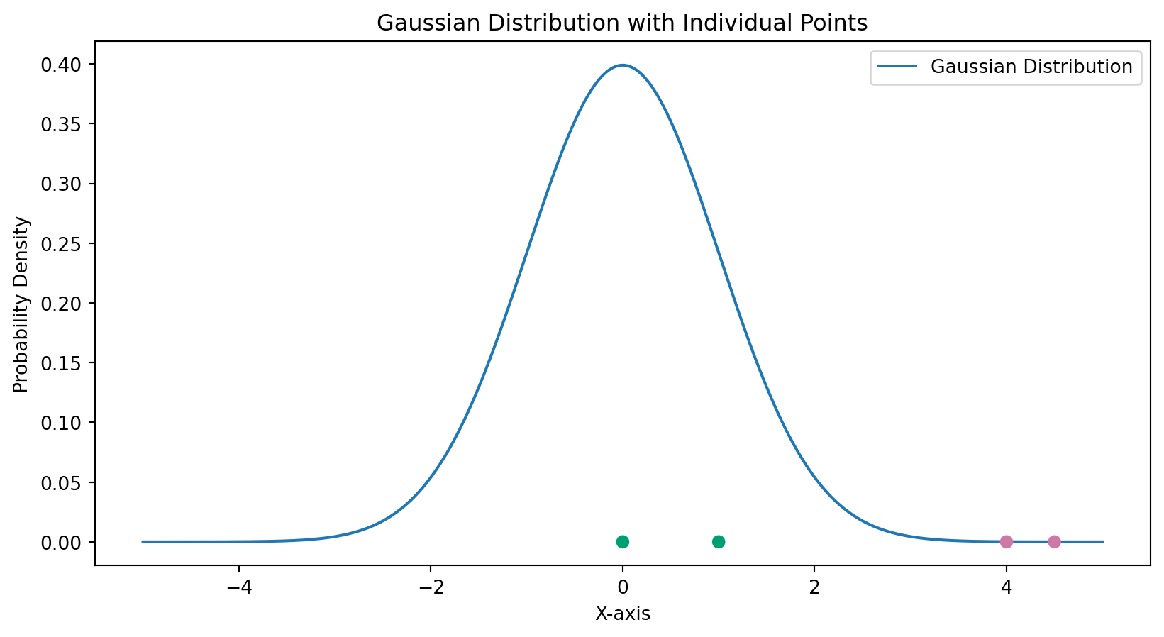
Visualizing the Pairwise Similarities
The Gaussian distribution is centered at point \(x_i\) and the points \(x_j\) that are further away have less probability of being chosen as neighbor.
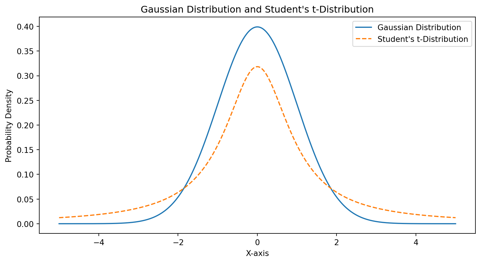
Code
import numpy as npimport matplotlib.pyplot as pltfrom scipy.stats import tmean =0std_dev =1x = np.linspace(-4, 4, 100)gaussian_y = (1/(std_dev * np.sqrt(2* np.pi))) * np.exp(-0.5* ((x - mean) / std_dev)**2)# Generate data for Student's t-distribution with 10 degrees of freedomdf =1t_y = t.pdf(x, df)# Create the plotplt.plot(x, gaussian_y, label='Gaussian Distribution')plt.plot(x, t_y, label="Student's t-Distribution", linestyle='dashed')# Add labels and titleplt.xlabel('X-axis')plt.ylabel('Probability Density')plt.title('Gaussian Distribution and Student\'s t-Distribution')plt.legend()# Show the plotplt.show()
Step 2: Define Low-Dimensional Map
Initialize points randomly in the low-dimensional space.
Define a similar probability distribution using a simplified Student-t distribution: \[
q_{ij} = \frac{(1 + \|y_i - y_j\|^2)^{-1}}{\sum_{k \neq l} (1 + \|y_k - y_l\|^2)^{-1}}.
\]
Step 3: Minimize Kullback-Leibler Divergence
Minimize the Kullback-Leibler (KL) divergence between the high-dimensional and low-dimensional distributions: \[
KL(P \| Q) = \sum_{i \neq j} p_{ij} \log \frac{p_{ij}}{q_{ij}}.
\]
The KL divergence measures how different distribution \(P\) is from distribution \(Q\). In other words, how different are each of the higher dimensional \(P_i\) point distributions from the lower dimensional \(Q_i\) distributions.
By minimizing this function, we ensure that the lower dimensional point clusters are similar to the higher dimensional clusters.
To minimize the KL divergence we use gradient descent on \(\partial KL / \partial y_i\) to iteratively adjust the positions of points, \(y_i\), in the low-dimensional space.
Case Study: Digits
Let’s consider how t-SNE performs clustering the MNIST digits datset.
Code
from sklearn.manifold import TSNEfrom sklearn import datasetsdigits = datasets.load_digits()X = digits.datay = digits.targettsne = TSNE(n_components=2, random_state=42)X_tsne = tsne.fit_transform(X)plt.figure(figsize=(5, 5))scatter = plt.scatter(X_tsne[:, 0], X_tsne[:, 1], c=y, cmap='tab20', edgecolor='k', s=50)plt.title('Digits in t-SNE Space')plt.xlabel('tSNE Component 1')plt.ylabel('tSNE Component 2')# Create a legend with discrete labelslegend_labels = np.unique(y)handles = [plt.Line2D([0], [0], marker='o', color='w', markerfacecolor=plt.cm.tab20(i /9), markersize=10) for i in legend_labels]plt.legend(handles, legend_labels, title="Digit Label", bbox_to_anchor=(1.05, 1), loc='upper left', borderaxespad=0.)plt.show()
The Key Insight
t-SNE uses different probability distributions for each step:
High dimensions: Gaussian (normal) distribution
Measures similarity based on Euclidean distance
Low dimensions: Student’s t-distribution
Has “heavier tails” than Gaussian
Allows moderate distances in low-D to represent larger distances in high-D
Helps prevent crowding and creates better separation
Perplexity controls how t-SNE balances local vs. global structure
Think of it as “how many neighbors to consider”
Low perplexity (5-10): Focuses on very local structure
High perplexity (30-50): Considers broader neighborhood
Rule of thumb: - Should be less than the number of points - Try multiple values to see which reveals the best structure - Default of 30 often works well
Practical Tips
1. Preprocessing matters
Scale/normalize your features first
Consider PCA preprocessing for high dimensions
2. Try different perplexities
Run 3-5 different values
Look for consistent patterns across runs
3. Run multiple times
Results vary due to random initialization
Look for stable structures
4. Don’t over-interpret
Focus on local clusters, not global geometry
Use alongside other analysis methods
Summary
t-SNE is a powerful visualization tool that:
Makes high-dimensional data visible
Preserves local neighborhood structure
Reveals clusters and patterns effectively
Remember:
Only for visualization, not for modeling
Computationally intensive
Hyperparameters (especially perplexity) matter
Always complement with other analysis methods
Recap: t-SNE vs PCA
Feature
PCA
t-SNE
Speed
Fast
Slow
Purpose
Dimensionality reduction
Visualization
Preserves
Global variance
Local neighborhoods
Deterministic?
Yes
No (random initialization)
Distances
Meaningful
Not meaningful
Further analysis?
Yes
No
Best practice: Use PCA first to reduce to ~50 dimensions, then apply t-SNE
In-Class Exercise: Dimensionality Reduction with PCA and t-SNE